I have worked with prominent brands such as Starbucks and Whole Foods Market and volunteered with the American Red Cross, organizations that maintain rigorous brand and campaign standards. My experience also spans medium-sized companies like CultureFly, smaller organizations such as Orthopedic Associates of Dutchess County, and my own brand, Bruckaroni Toys n’ Thangs. Across these diverse environments, I have developed cohesive visual identities and packaging while collaborating with major studios, including Disney and Universal, and working within established brand guidelines. This range of experience has given me a strategic understanding of how to build distinctive, cohesive brands and packaging that remain true to a brand’s identity while resonating with its audience.
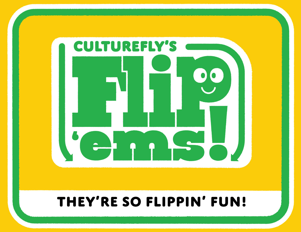
Before I joined, CultureFly’s packaging relied heavily on licensor assets, resulting in products that lacked a distinct and cohesive brand identity. With Flip ’ems!, I set out to establish a recognizable CultureFly look across the entire form factor.
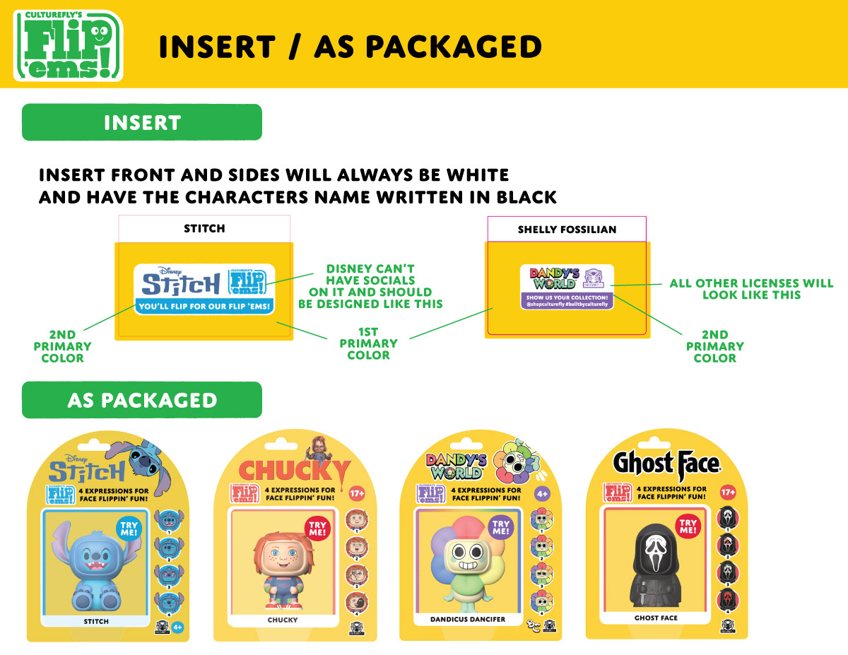
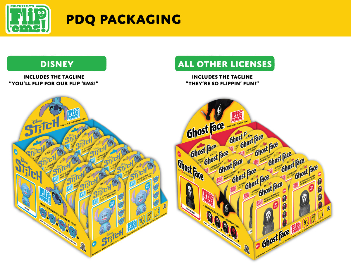
Introducing CultureFly’s own branding into licensed products was a new approach for the company and, for many licensors, a new way of thinking about the packaging. The process was particularly challenging with Disney. To build understanding and secure approval, I developed comprehensive brand guidelines that clearly defined the identity and demonstrated how it could work within the Flip ’ems! form factor. These guidelines also created a framework that future licensors could easily understand and approve. I negotiated thoughtful compromises along the way, balancing CultureFly’s brand goals with each licensor’s requirements.
The result was a cohesive, scalable packaging system that made the brand easy to execute. Today, anyone on the team can design Flip ’ems! packaging on-brand, and the format is often among the fastest to receive licensor approval.
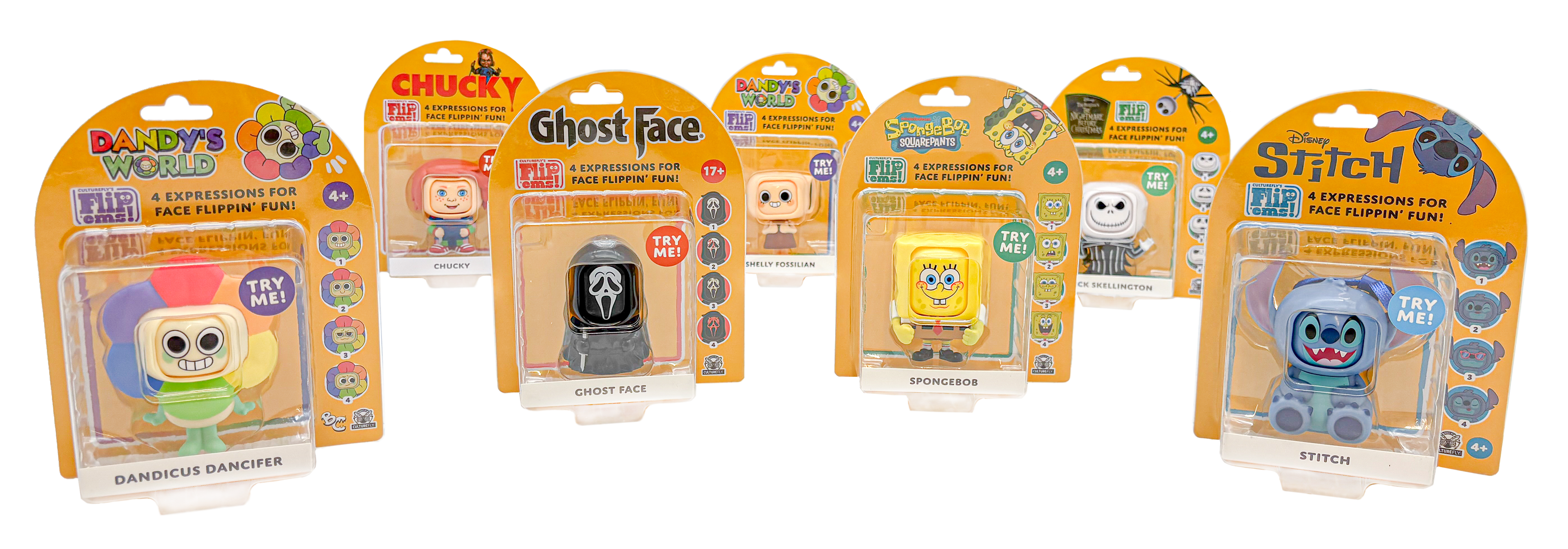
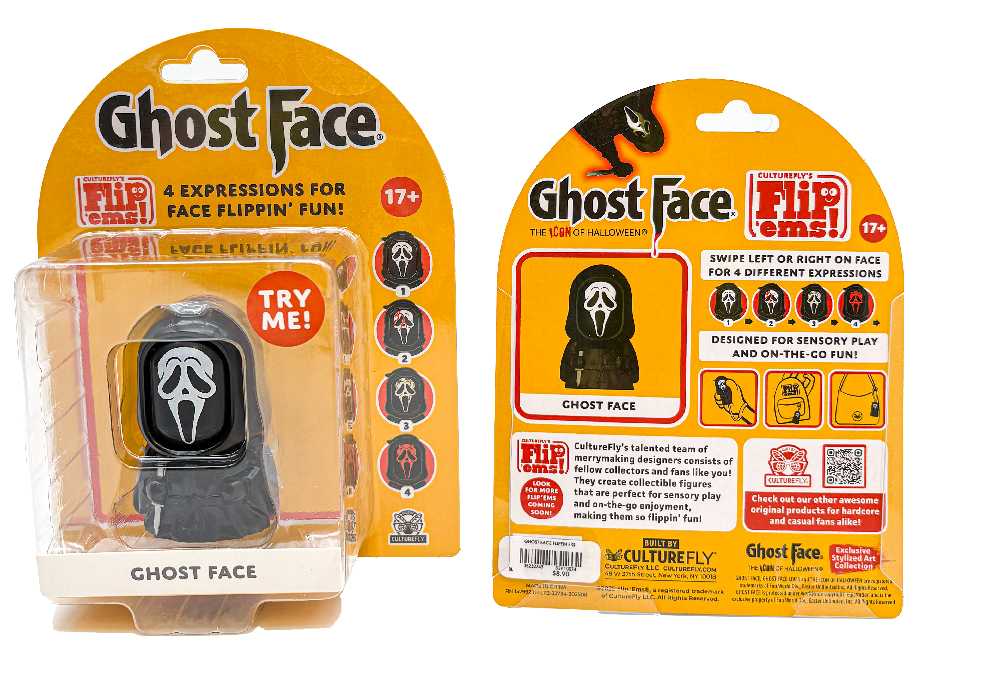
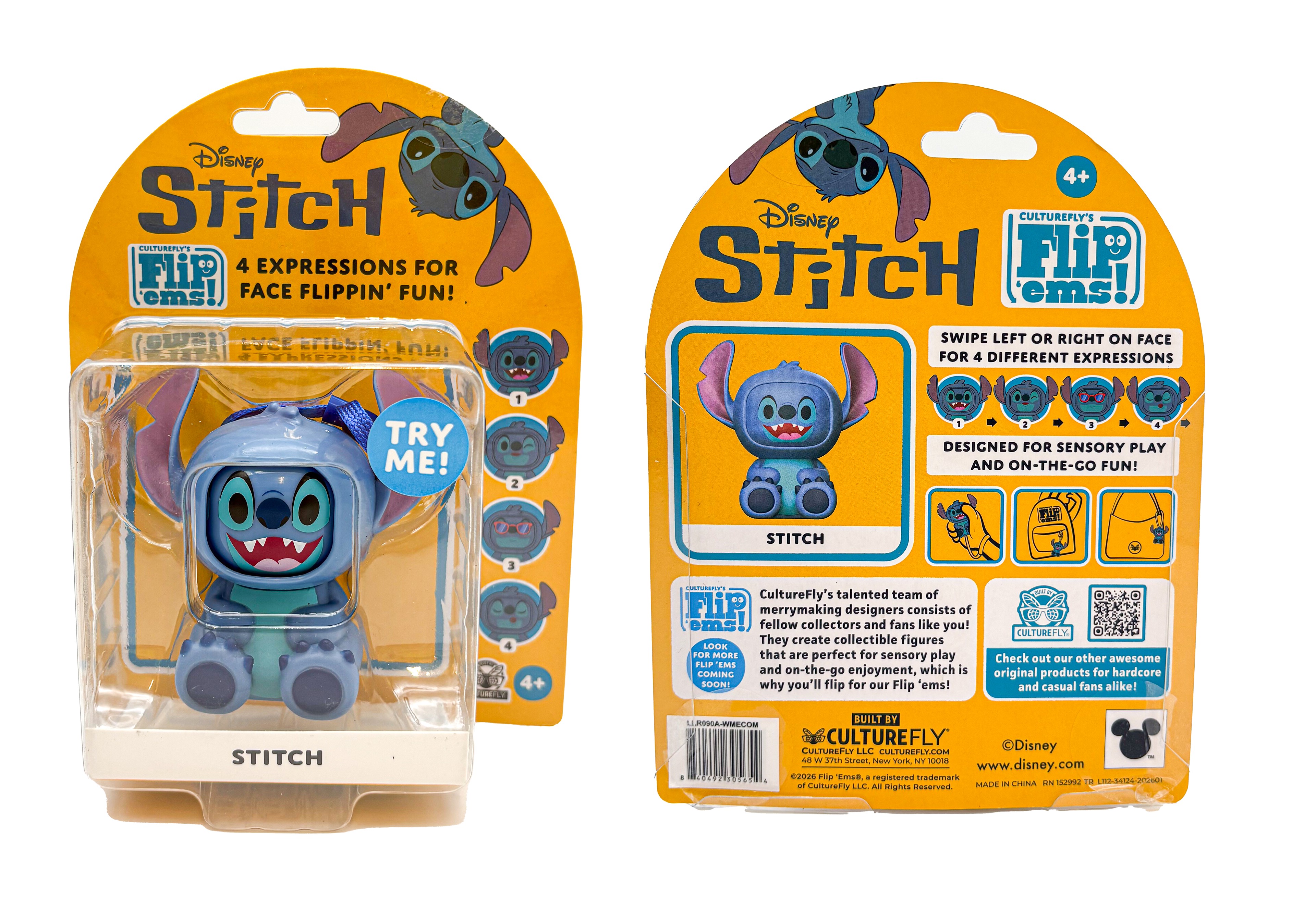
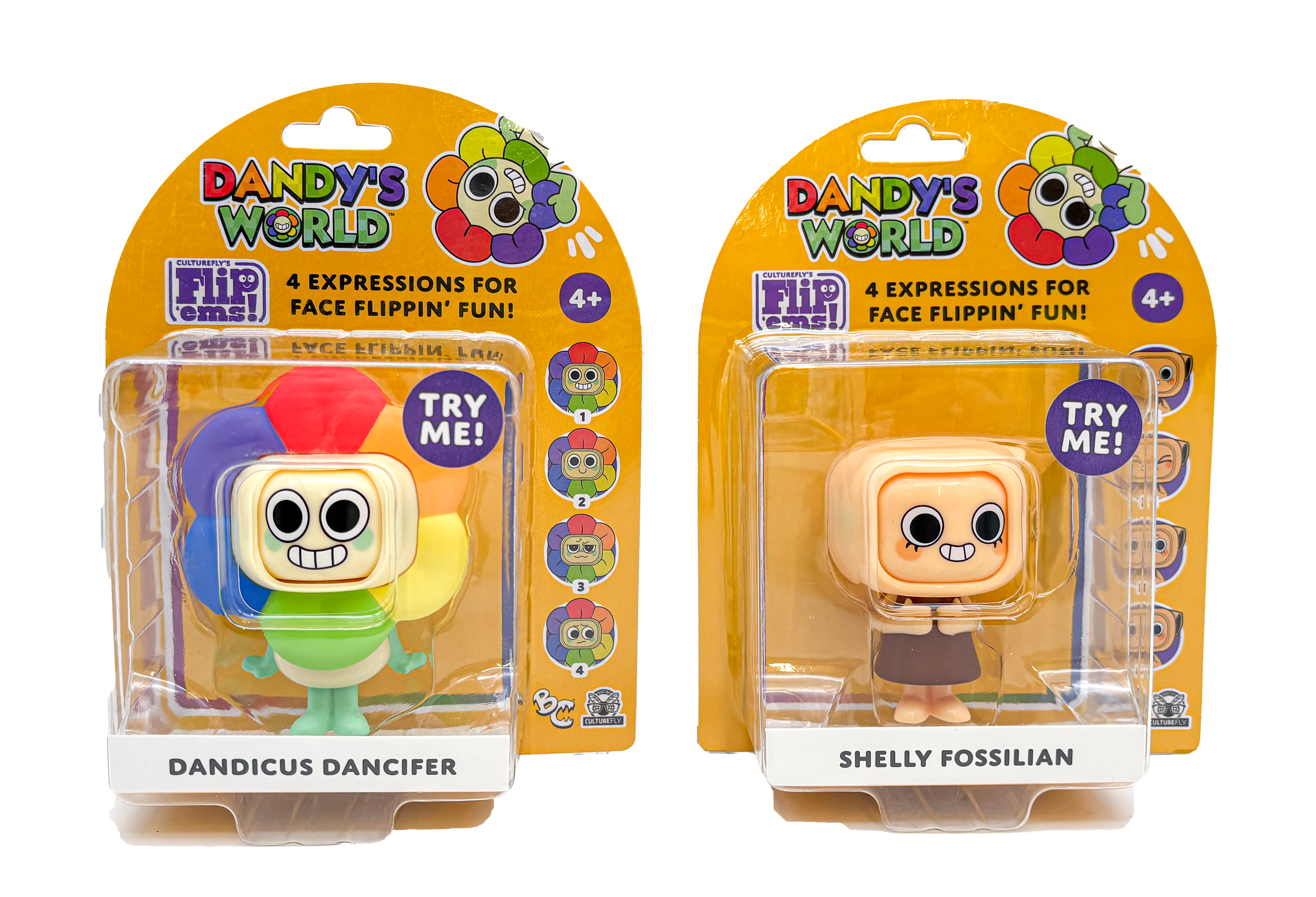
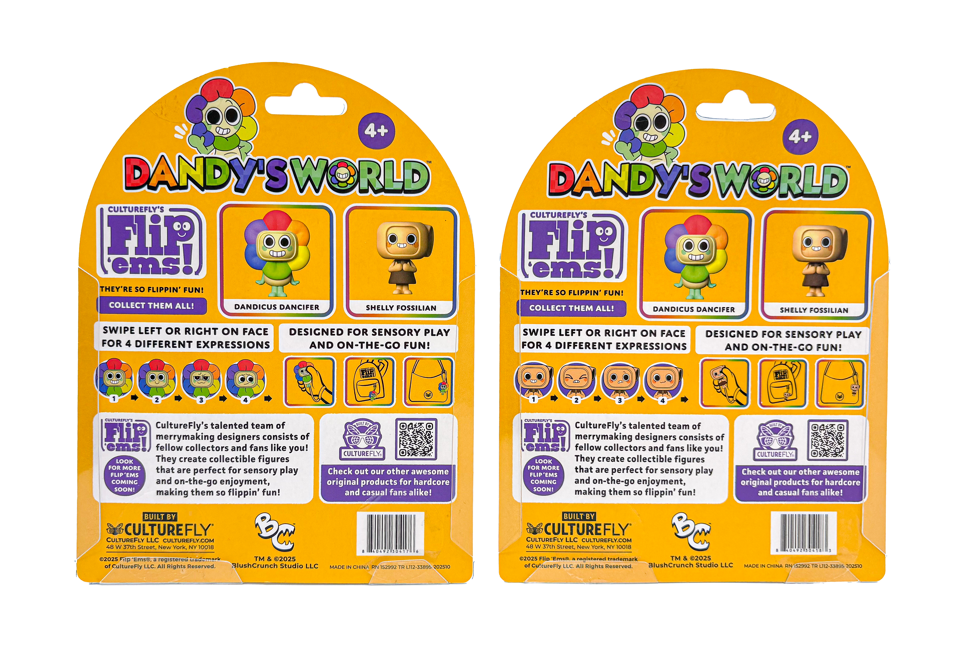
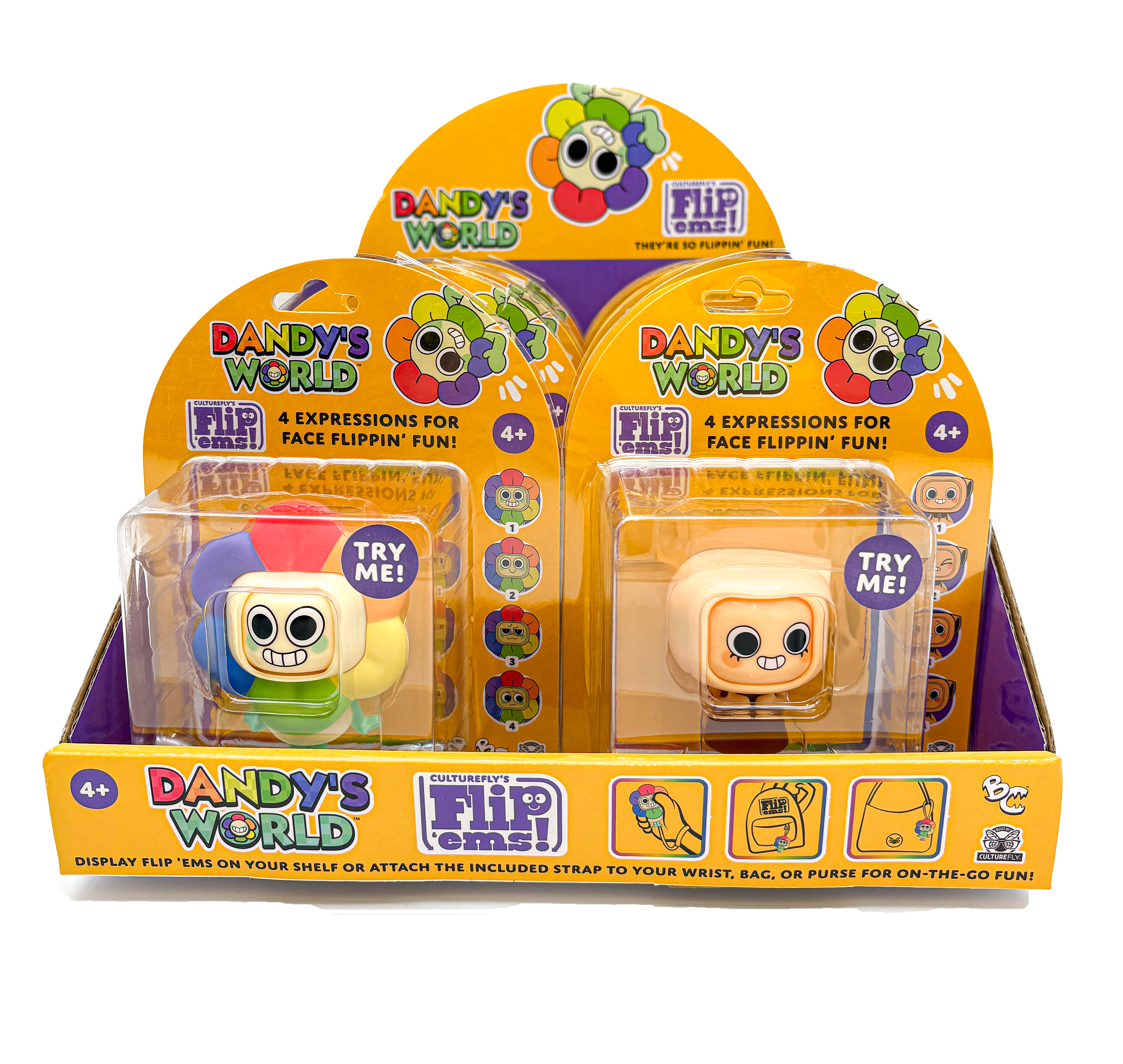
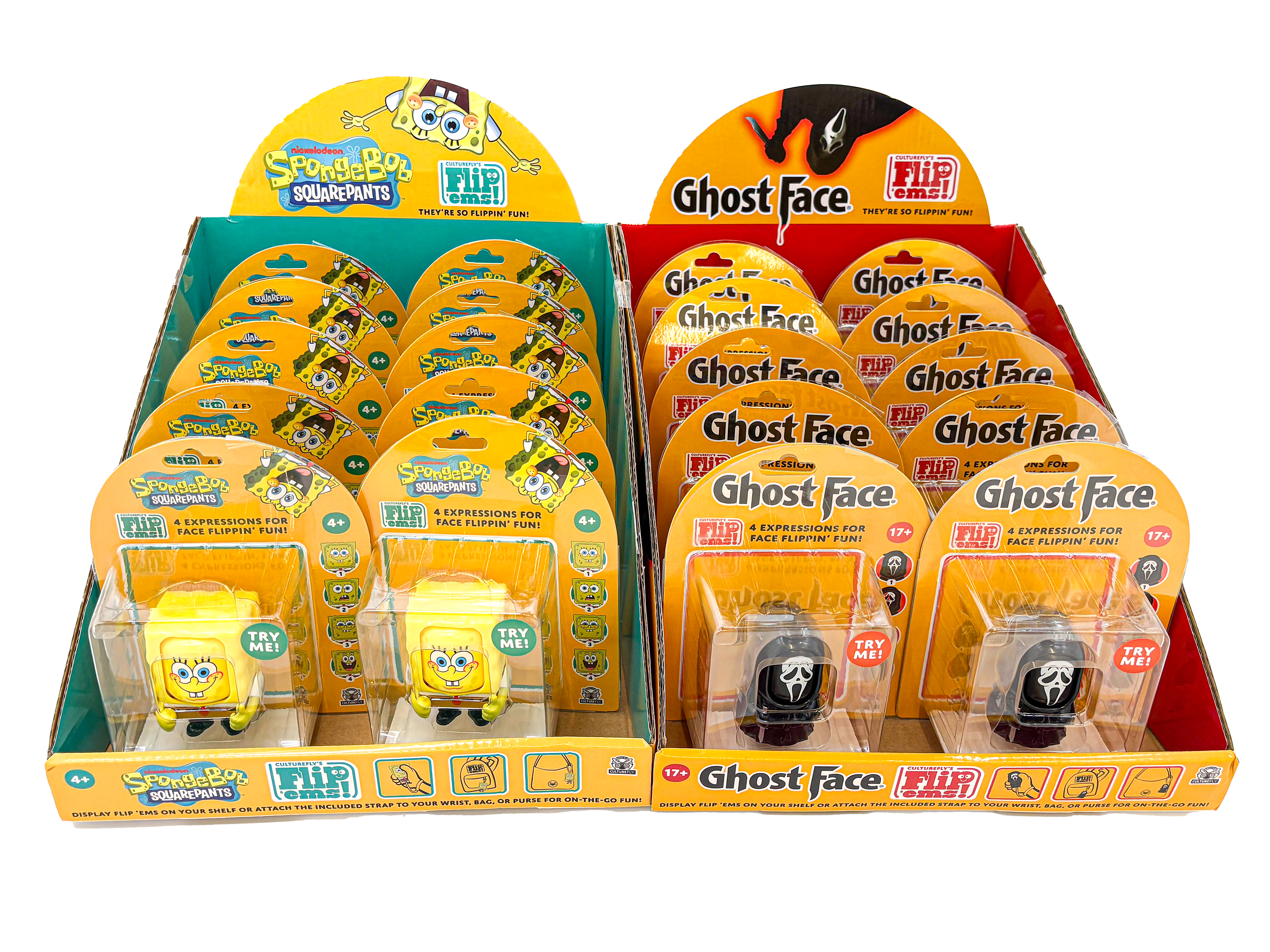
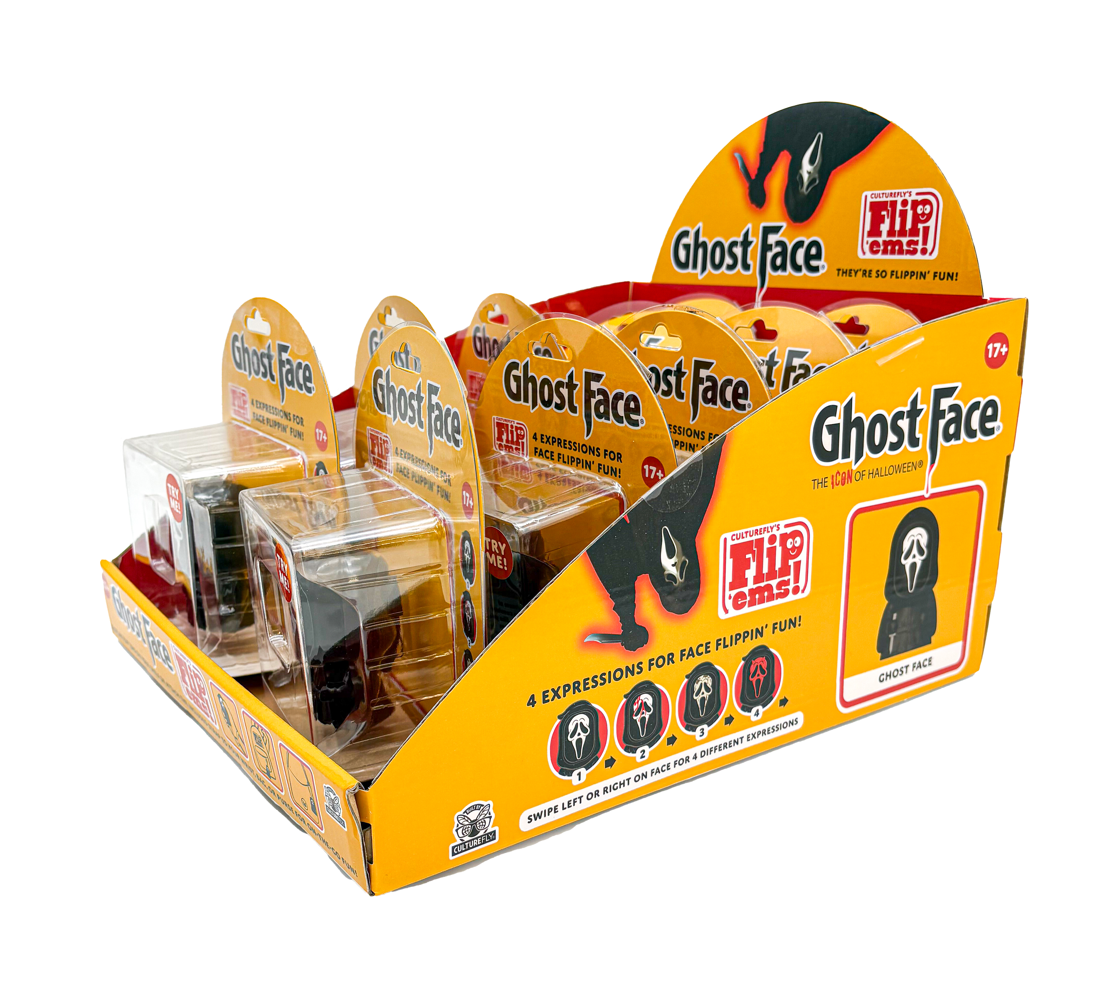
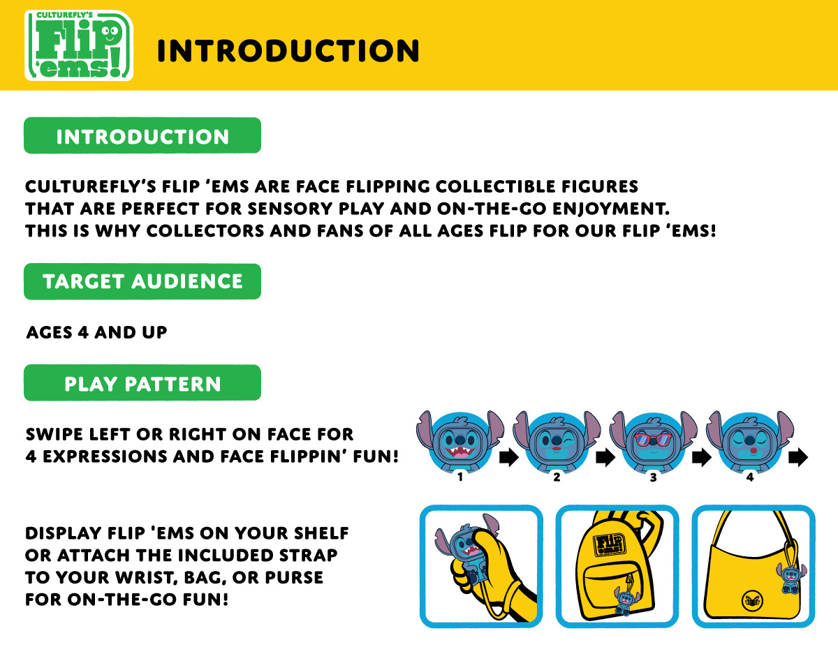
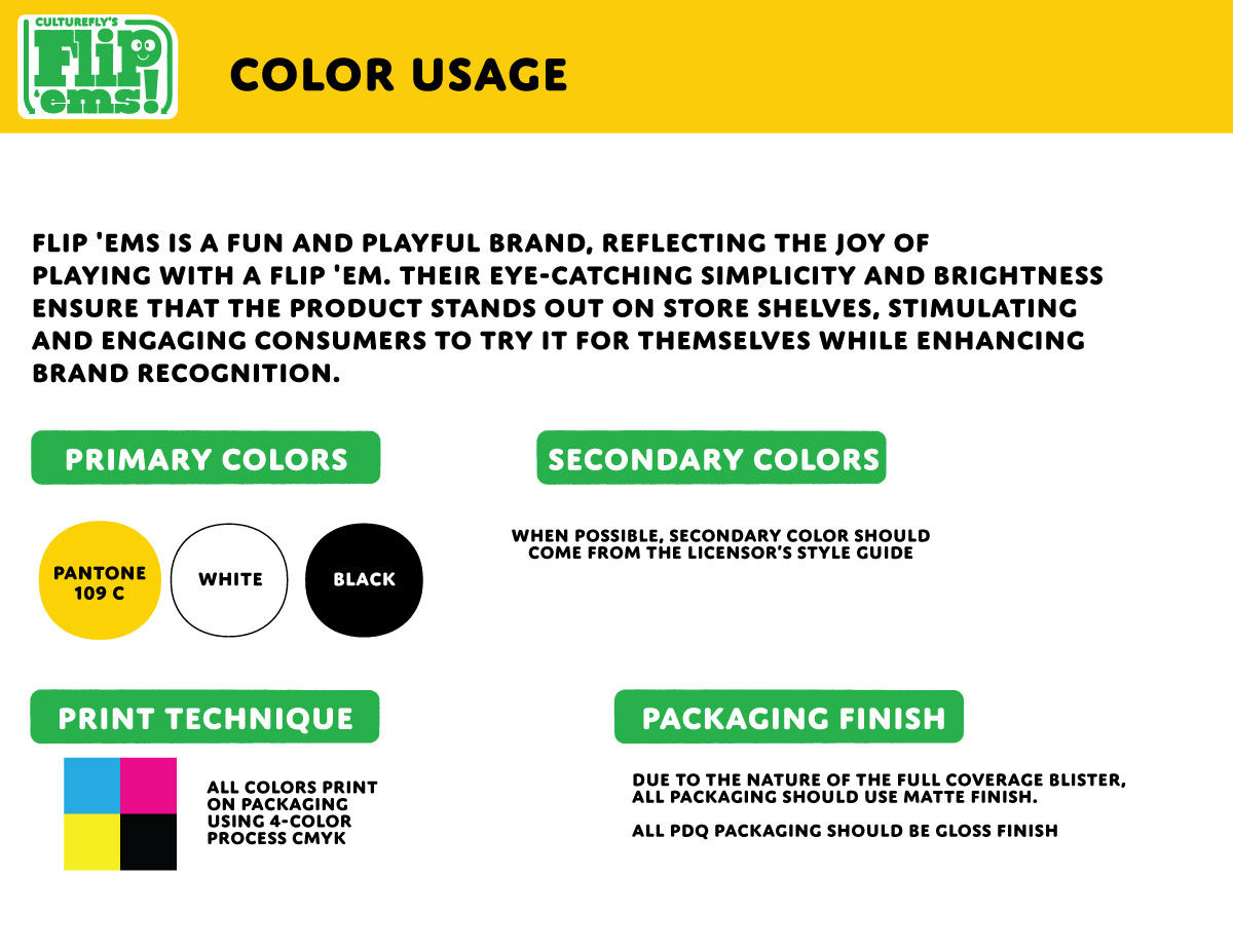
I’m unable to share the full guide I created, but below is a small selection of pages that helped communicate the vision and get Disney on board with the concept.
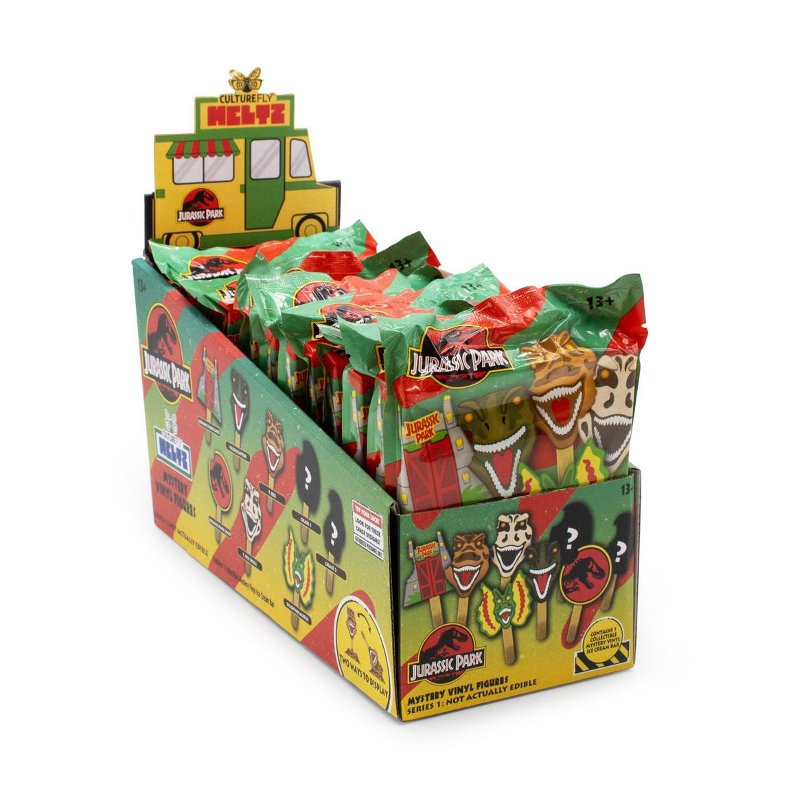
Meltz is CultureFly's most popular and consistent form factor. Before my involvement, products were packaged in polybags and the PDQ featured an ice cream truck design. While the layout was cohesive, it relied heavily on licensor assets. Initially I maintained the existing design, but I gradually infused more personality by updating the truck colors to suit each licensor, refining the layout and copy, and advocating for 3D renders instead of traditional photos. Throughout the process, I continually sought out innovative ways to evolve the packaging.
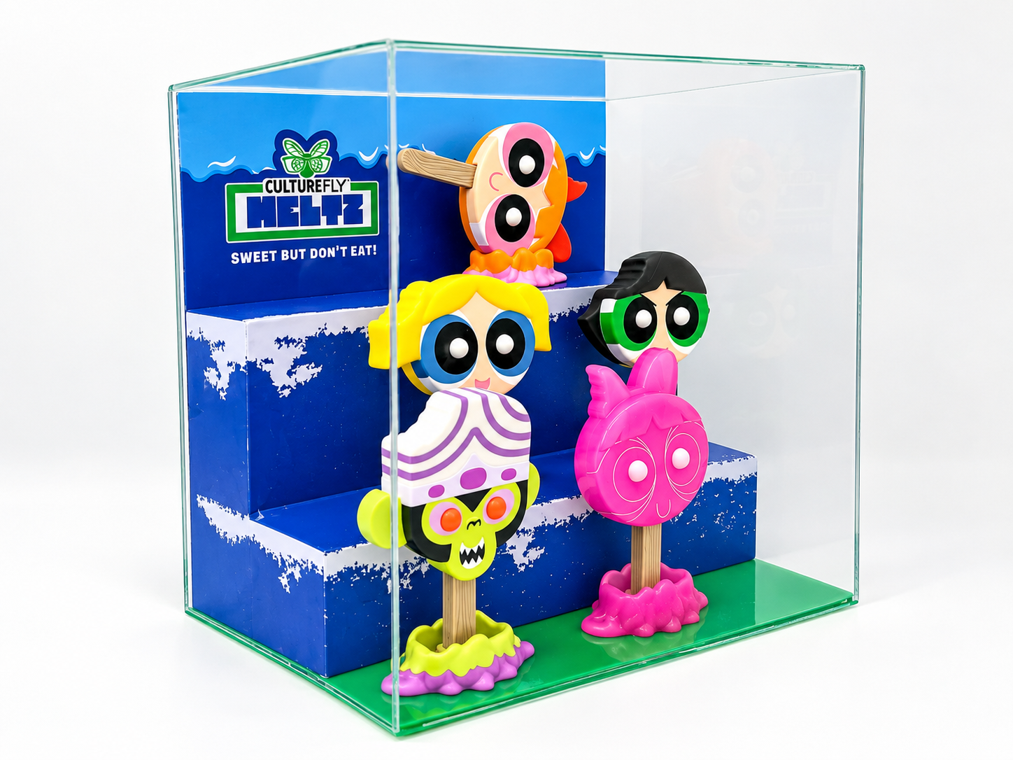
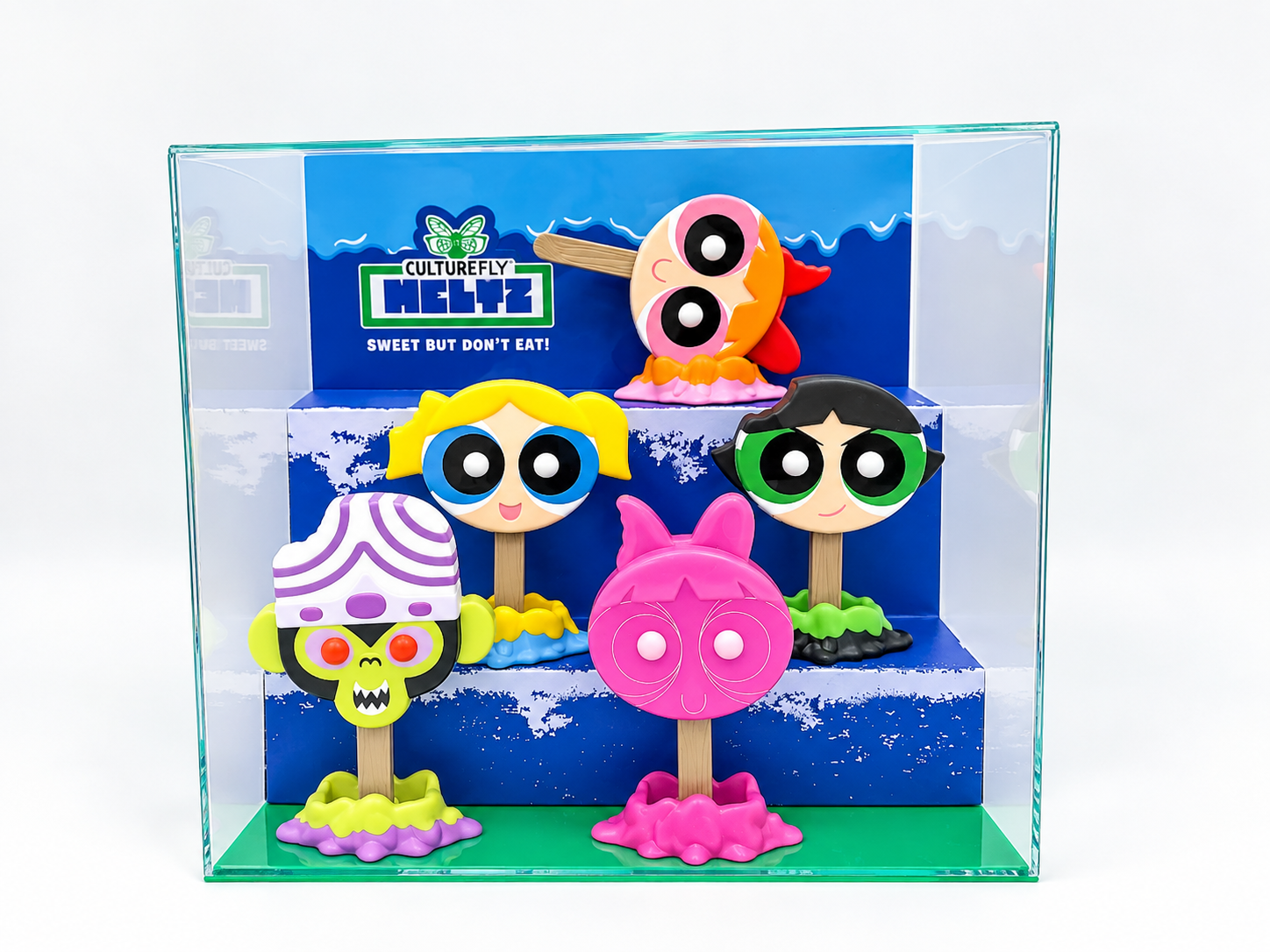
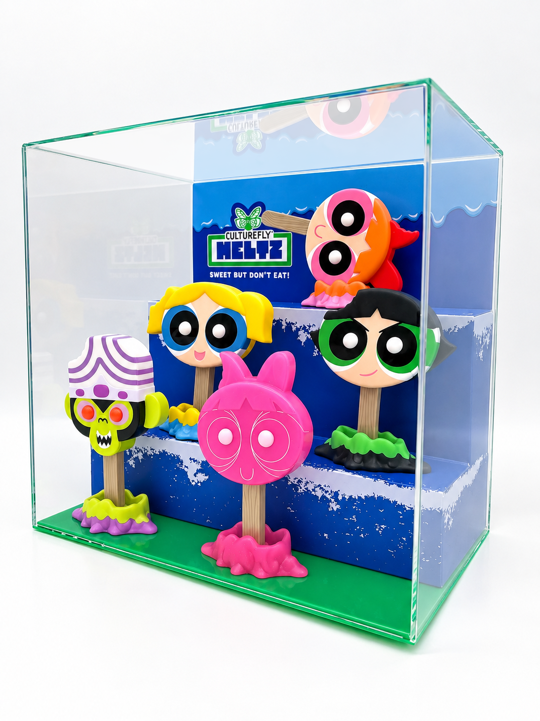
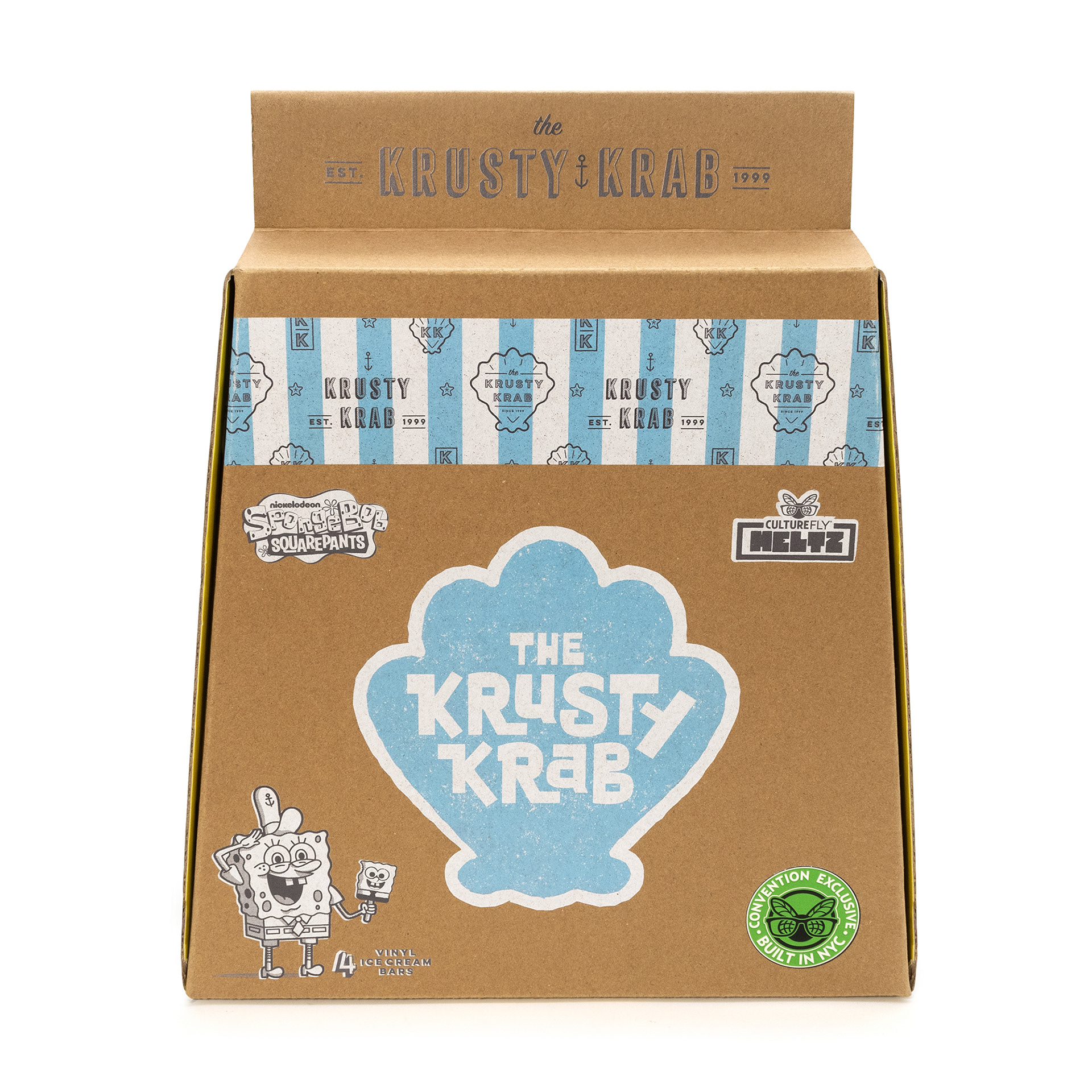
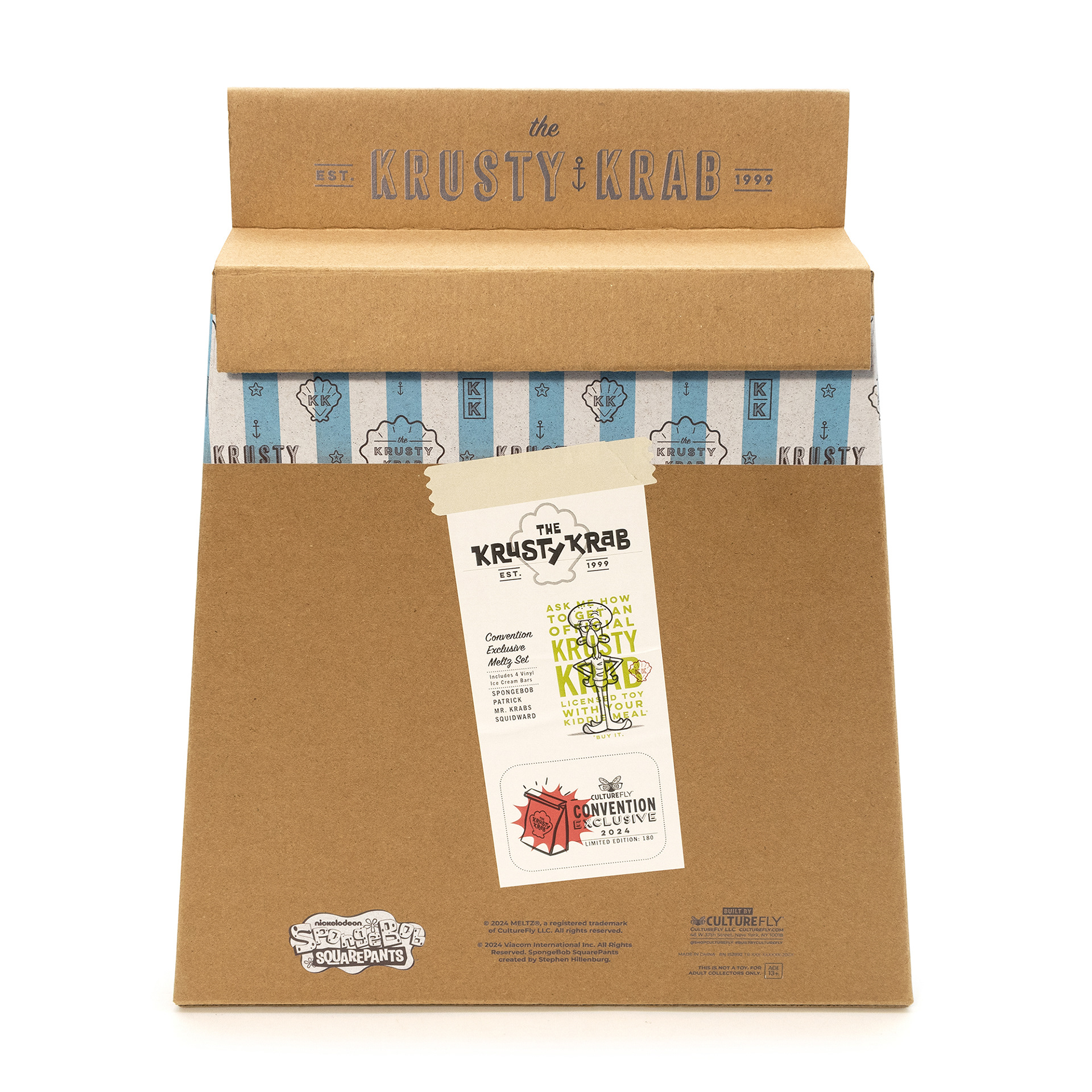
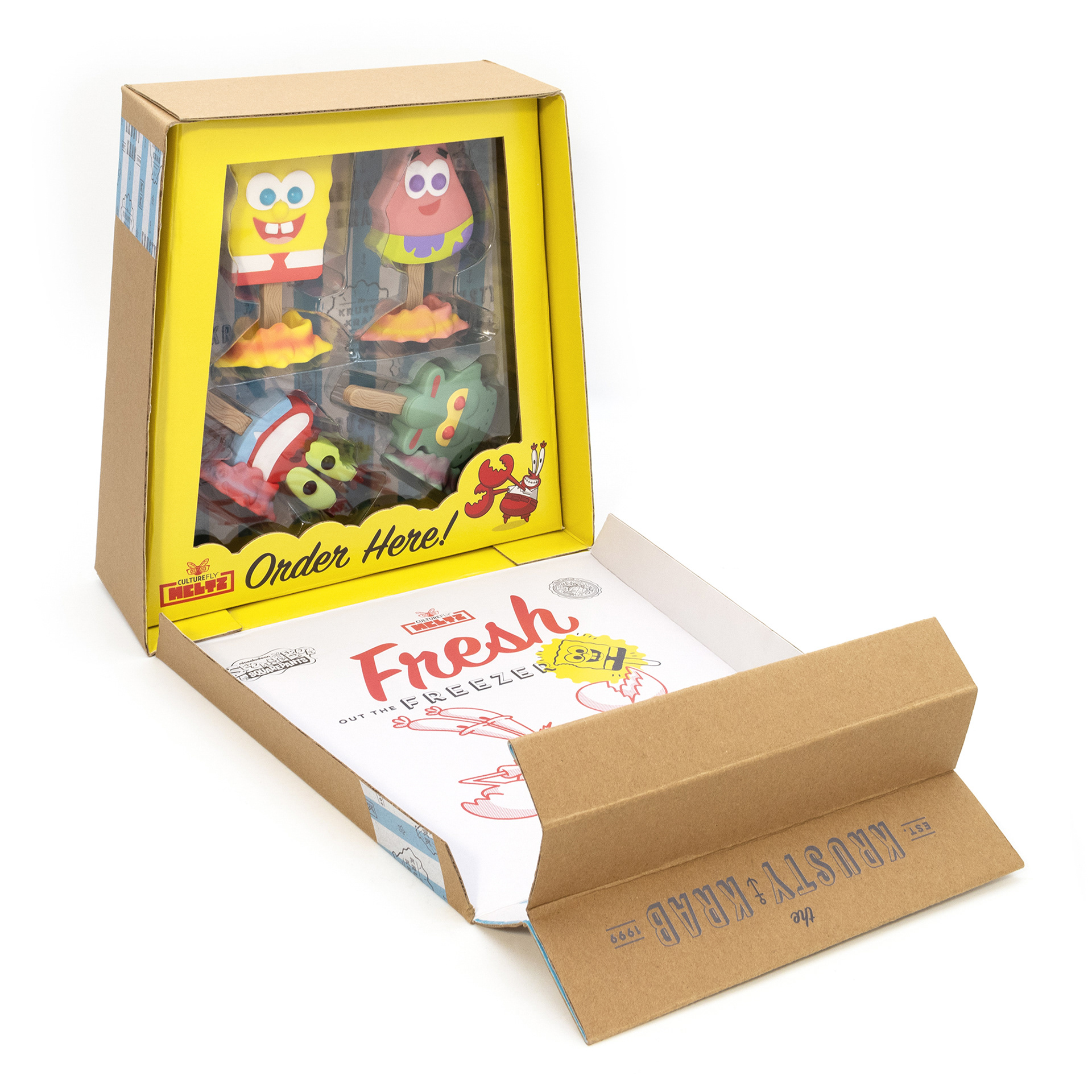
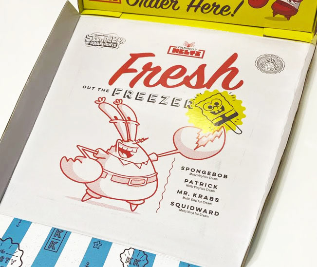
Soon after joining CultureFly, I began experimenting with the Meltz brand. This New York Comic Con exclusive was one of my first projects. I wanted to combine collectible appeal with functionality and designed the package to also serve as a display case.
I love creating packaging that combines creativity and functionality to deliver a joyful, memorable brand experience. My goal is to design packaging that feels like part of the product and is something customers want to interact with, display, and keep rather than simply discard.
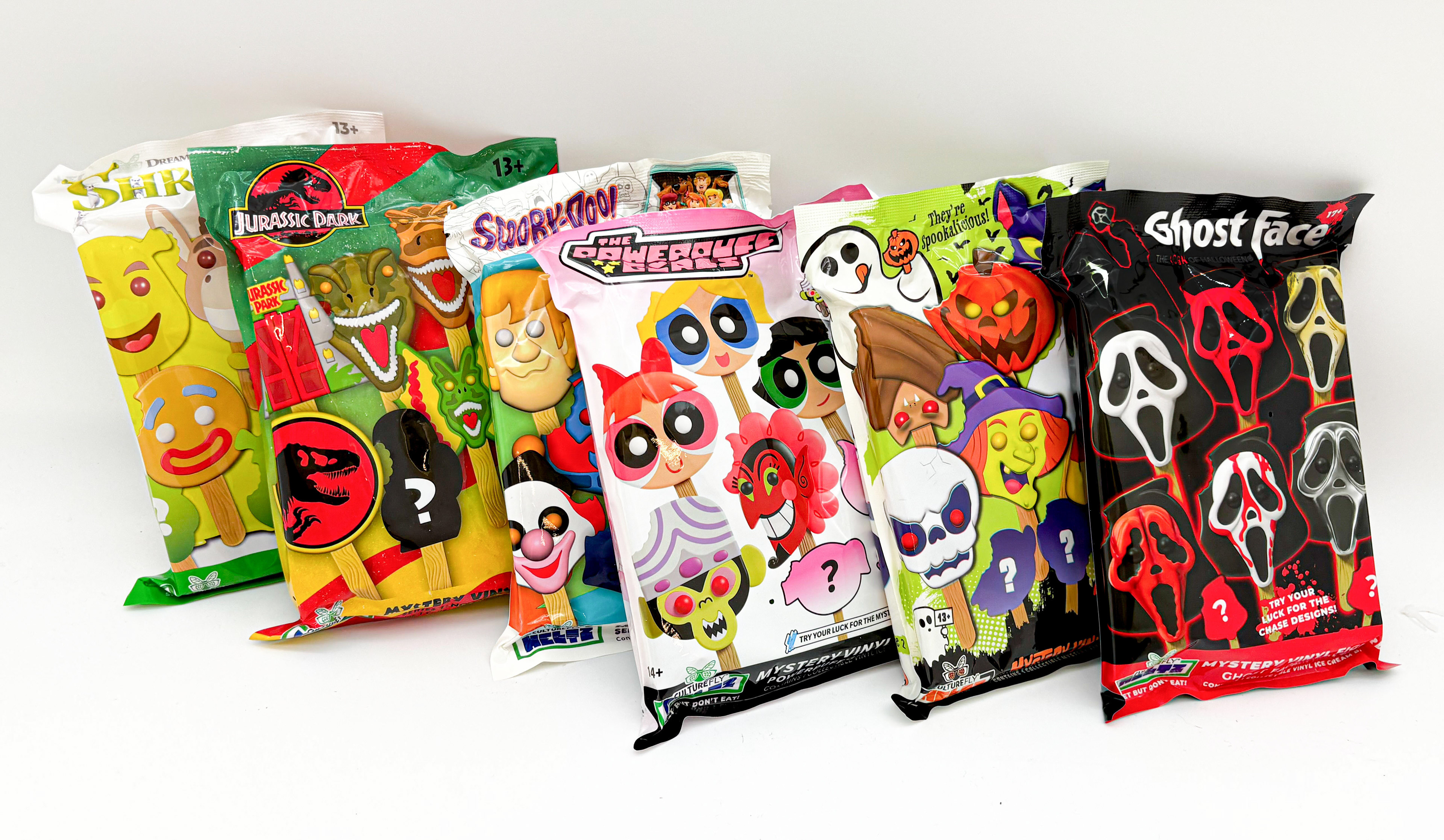
Fall 2025, CultureFly launched their first original, non-licensed, Meltz series. This marked the moment where I was able to really push the personality of the brand and packaging. Inspired by my passion for Halloween, food advertising mascots, and illustration, I created the packaging below!
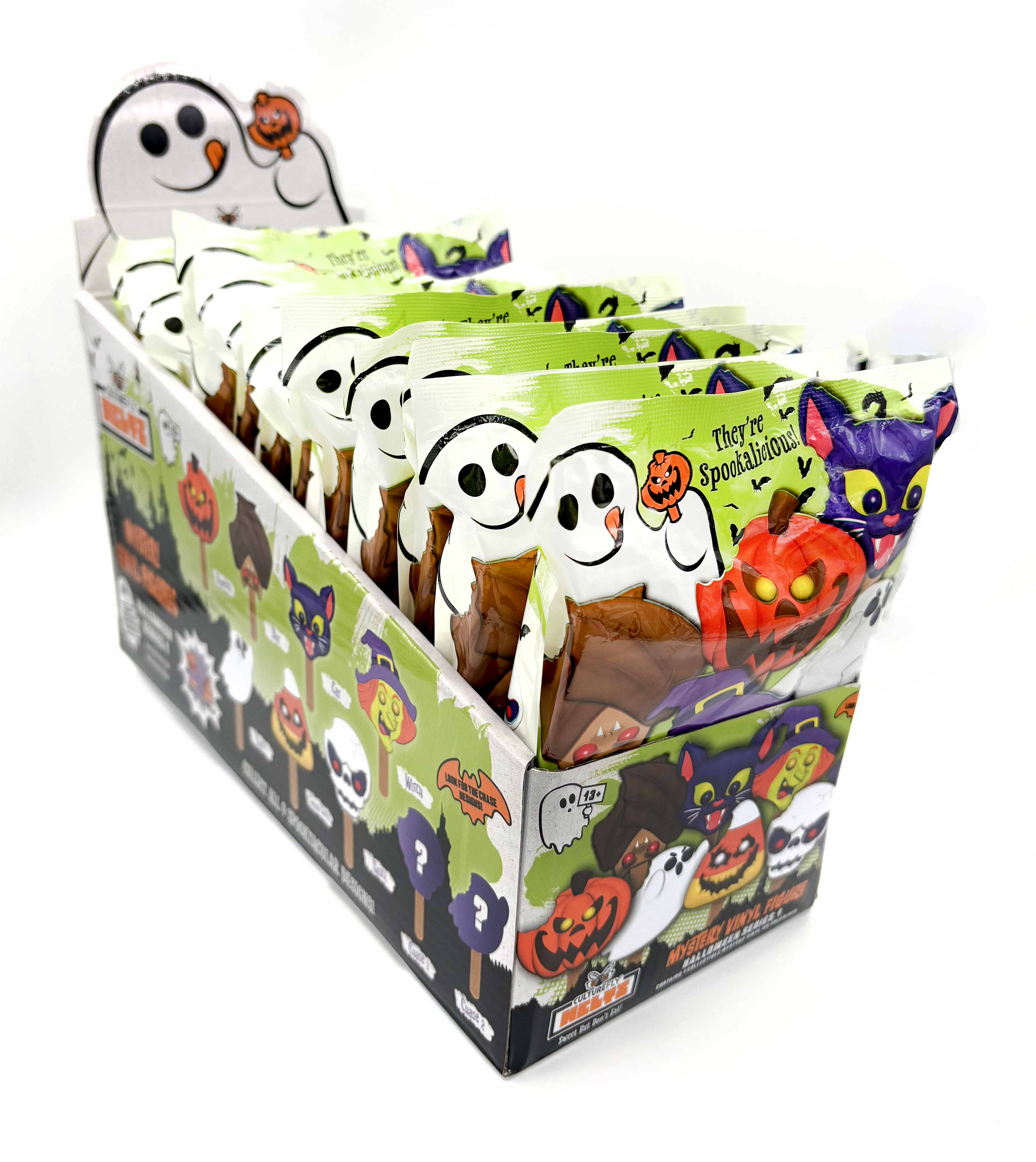
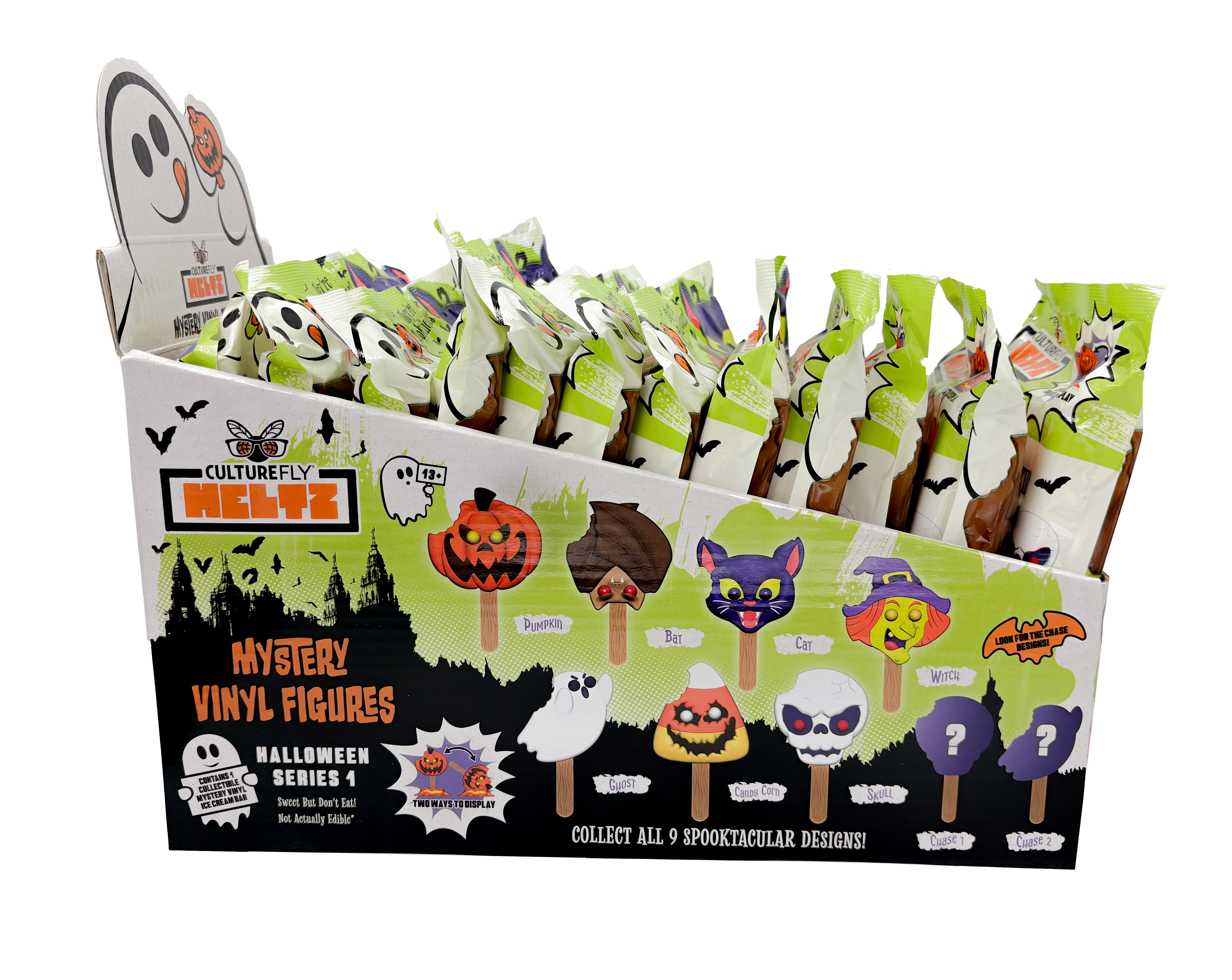
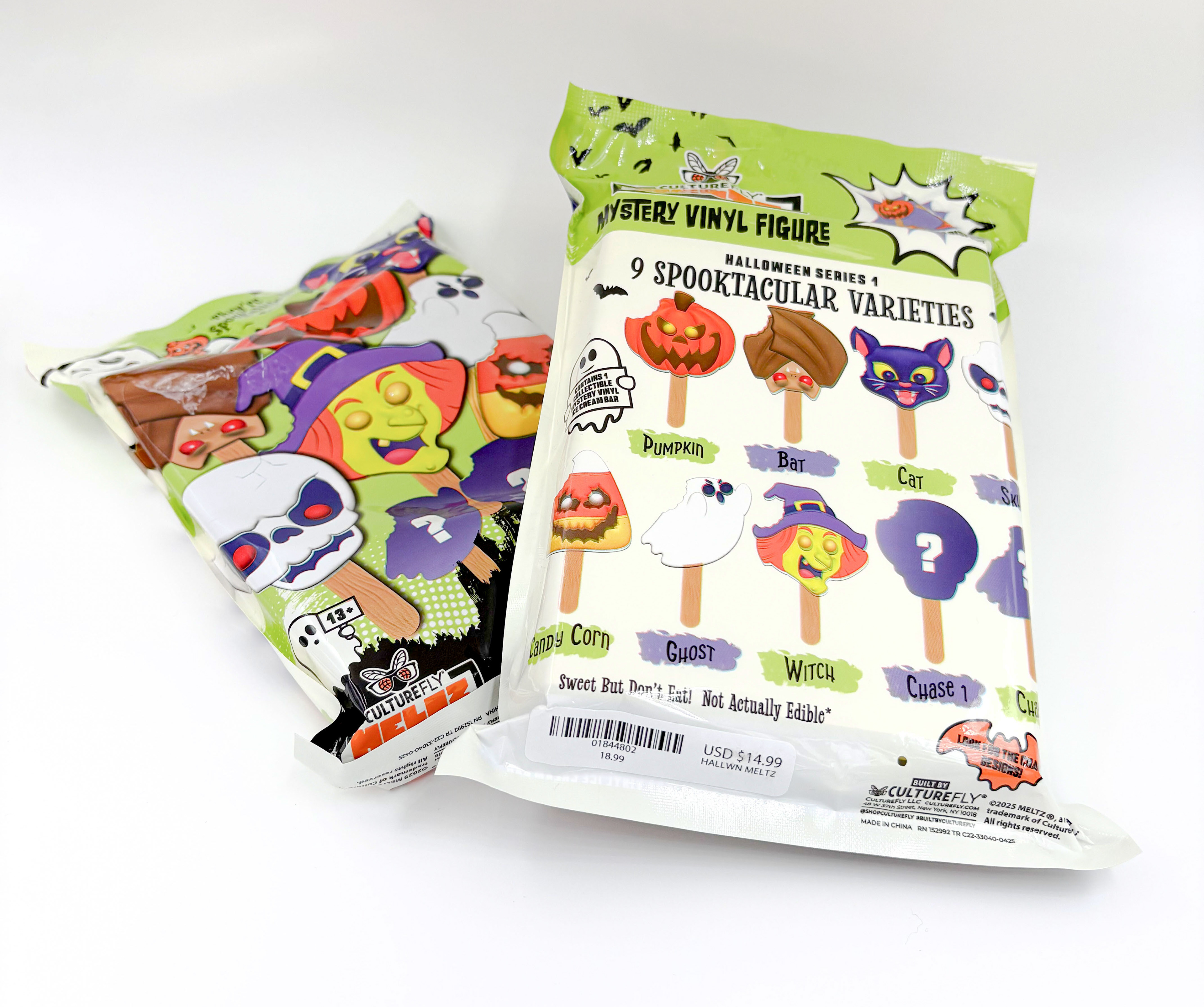
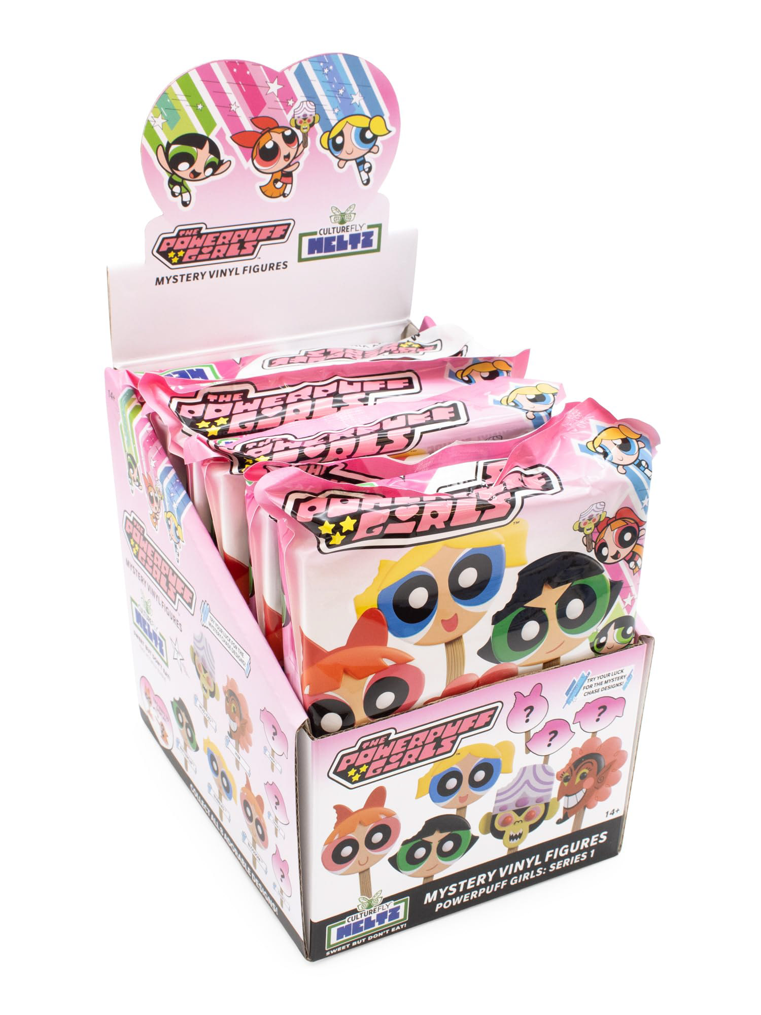
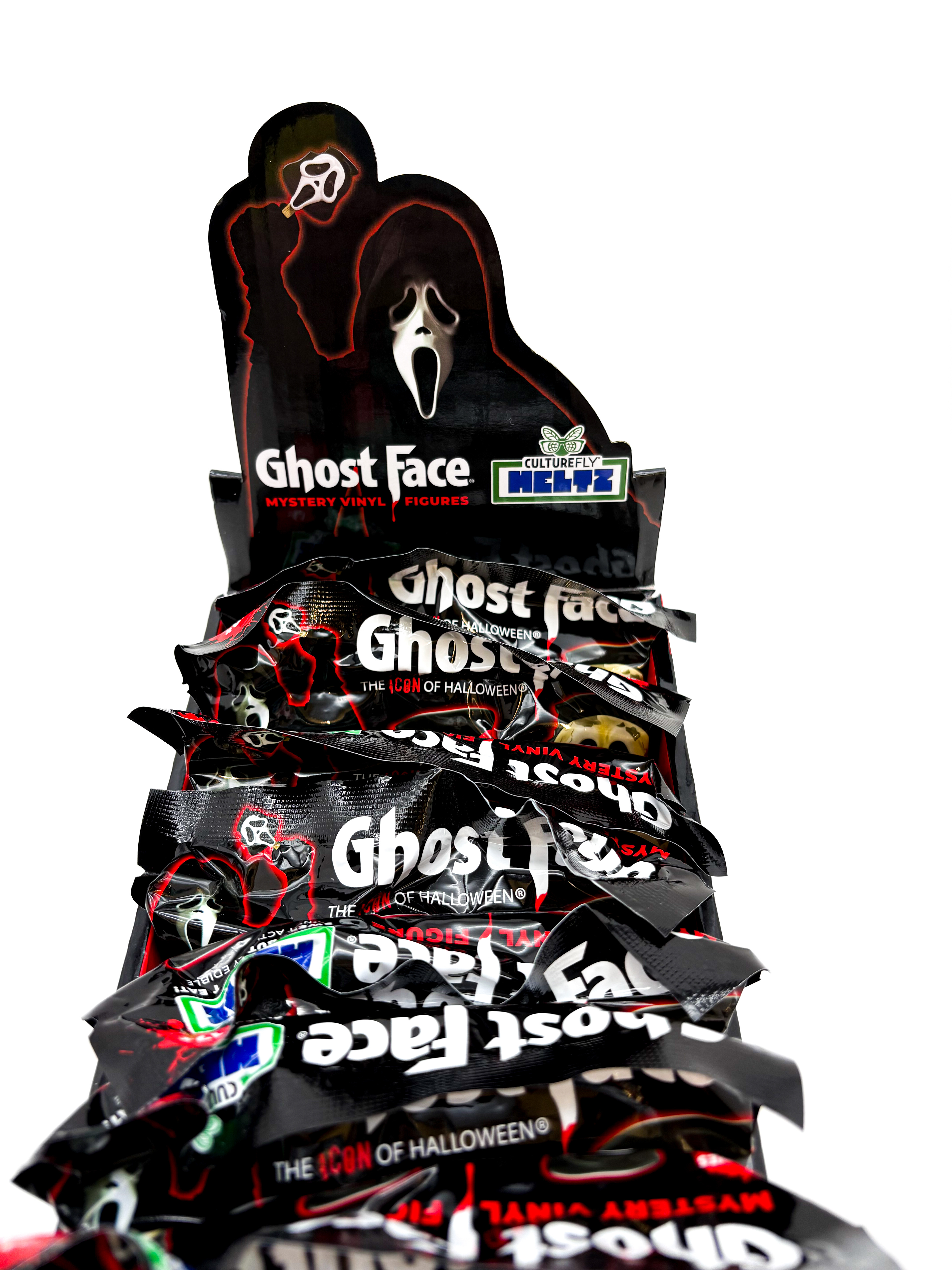
The ghost I illustrated holding a Meltz was very well received, so I began exploring whether we could secure licensor approvals to apply this concept to their characters as well. As you can see below, we received those approvals, and by this point, we had officially moved away from the truck concept and fully embraced this new layout.
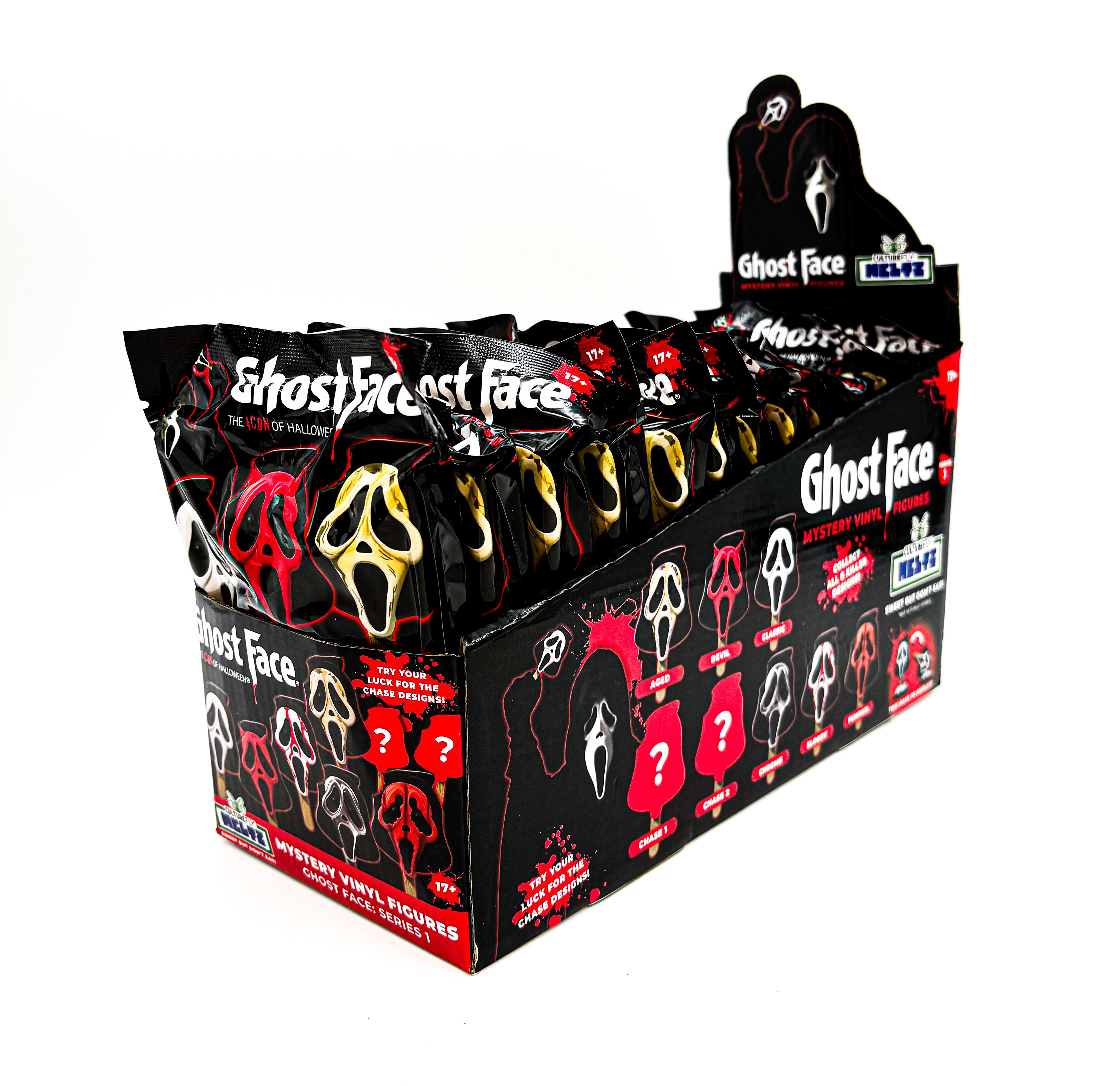
This past winter (2025), CultureFly had the exciting opportunity to introduce Meltz to Target stores, which had never carried the brand before. Target requested that Meltz be sold in tear boxes rather than polybags. Embracing this change, and recognizing both the popularity of Meltz and the potential for the form factor to evolve, I focused on creating a more cohesive and consistent brand identity that could grow with the line.
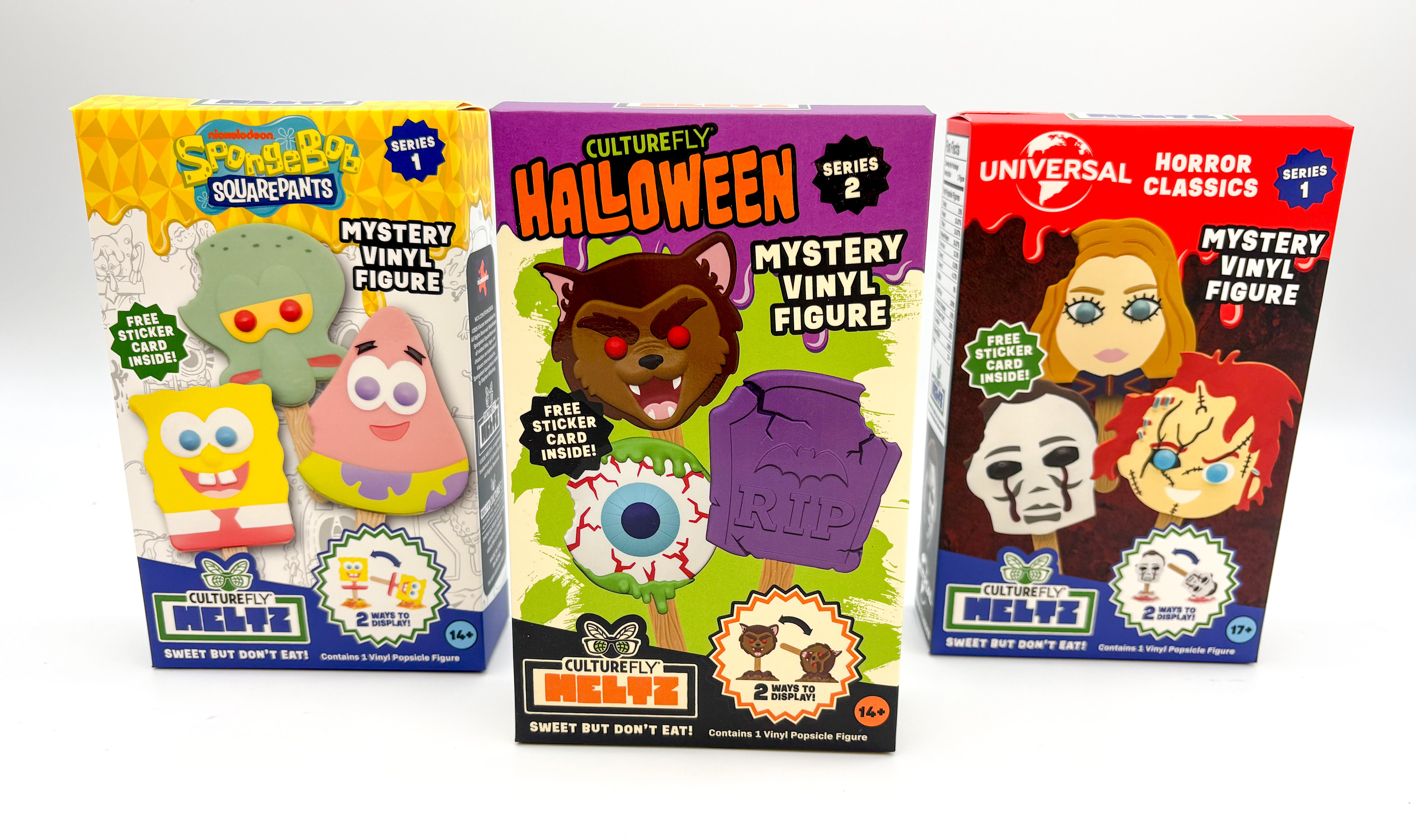
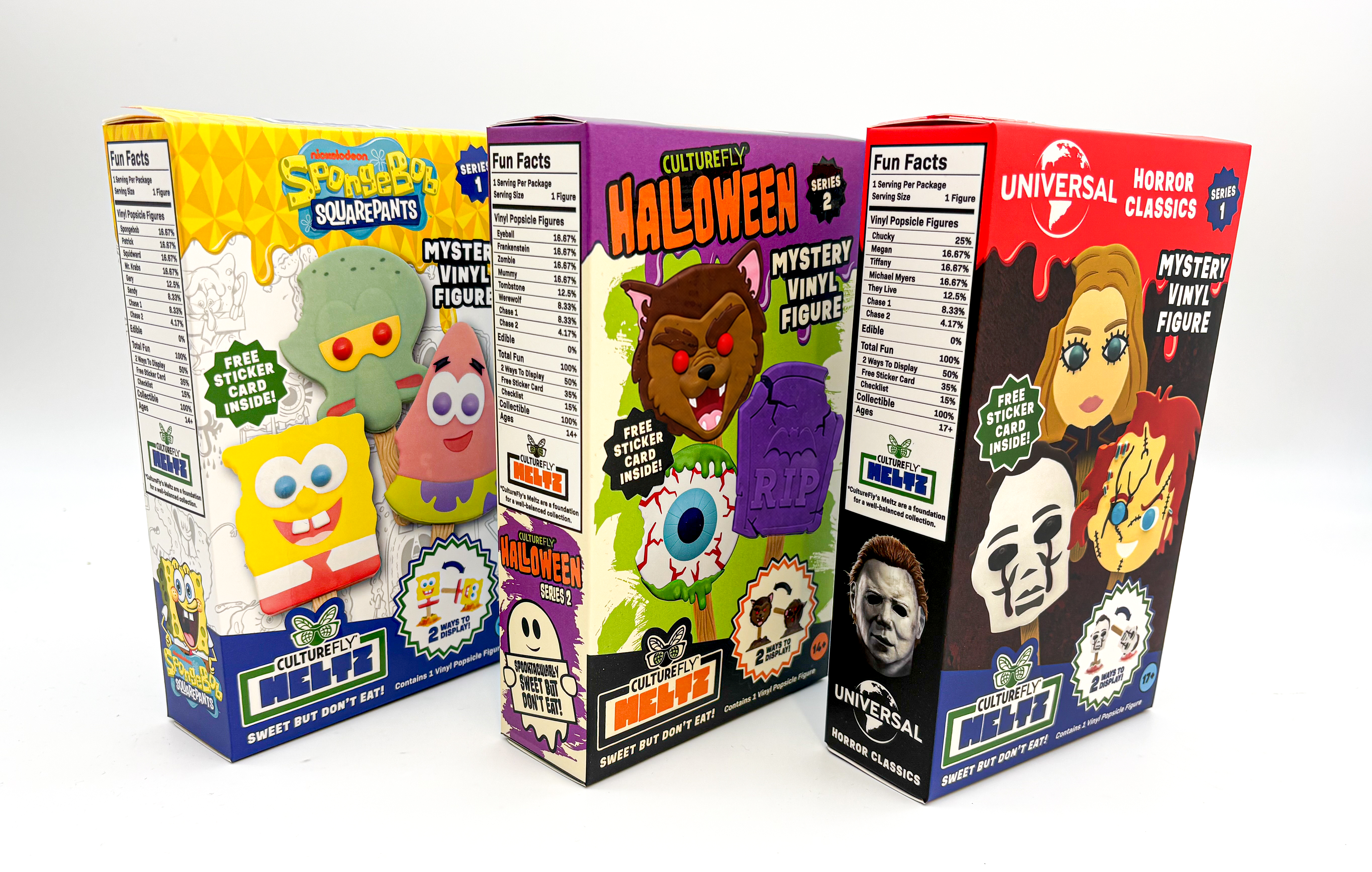
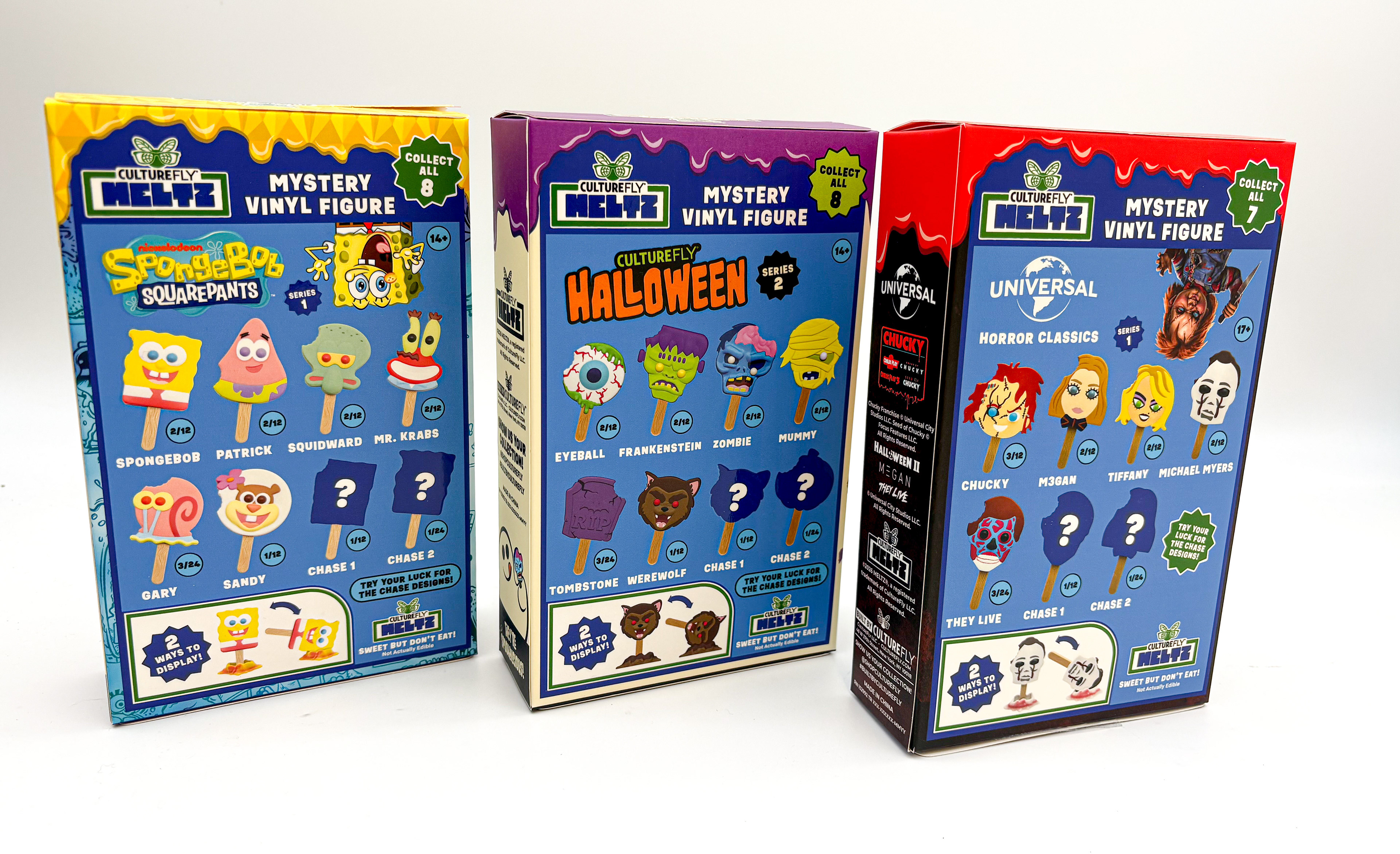
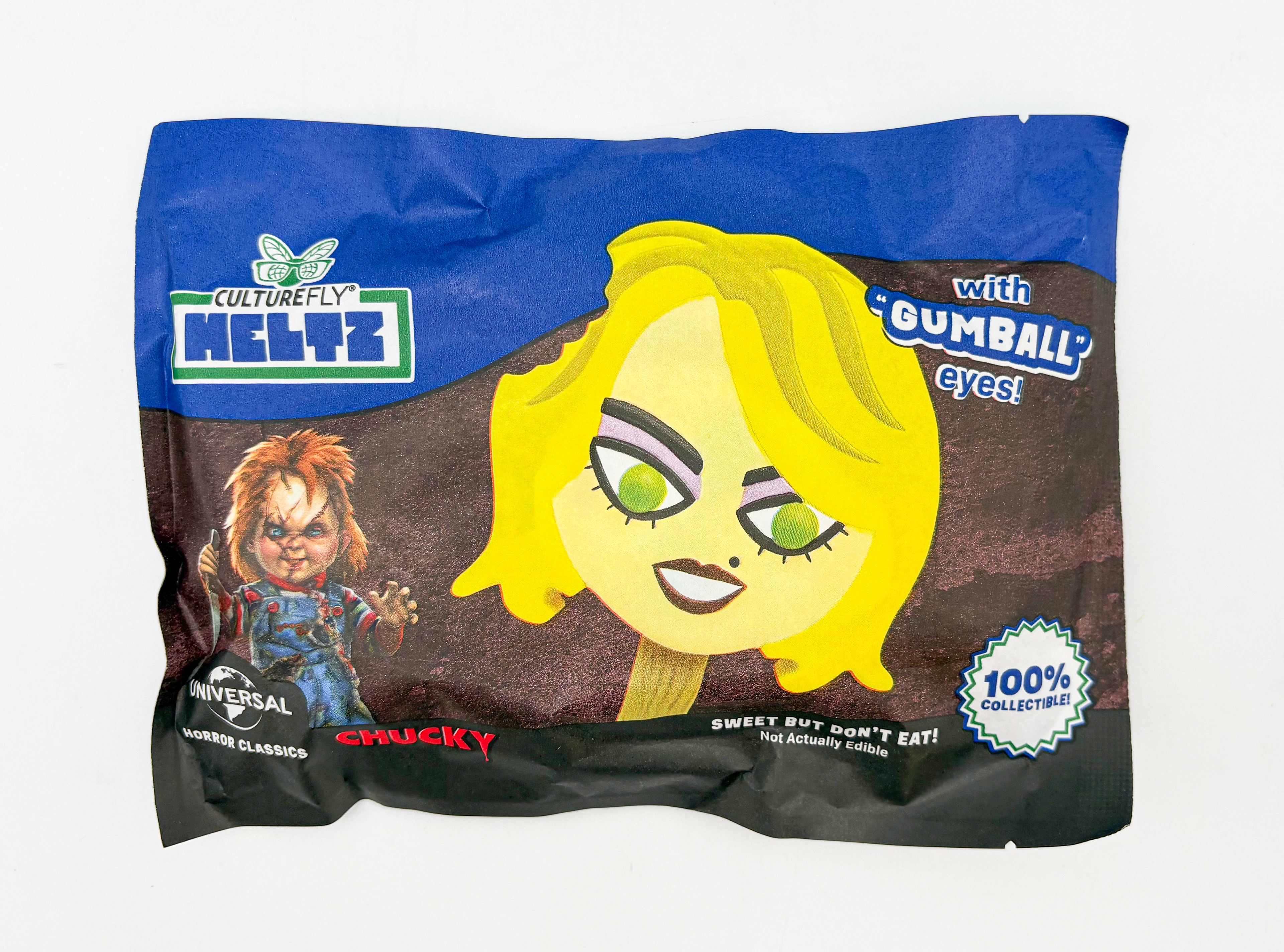
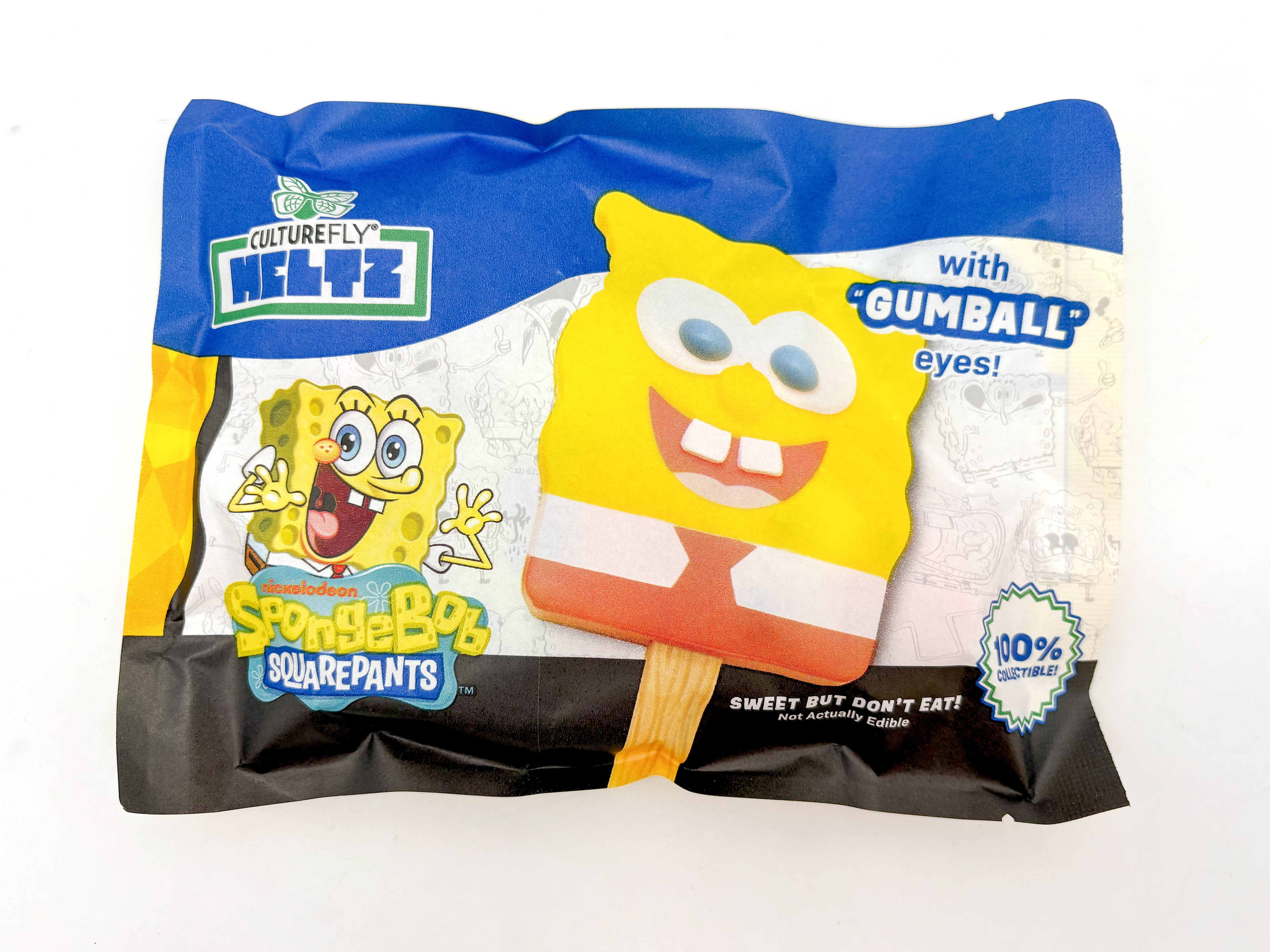
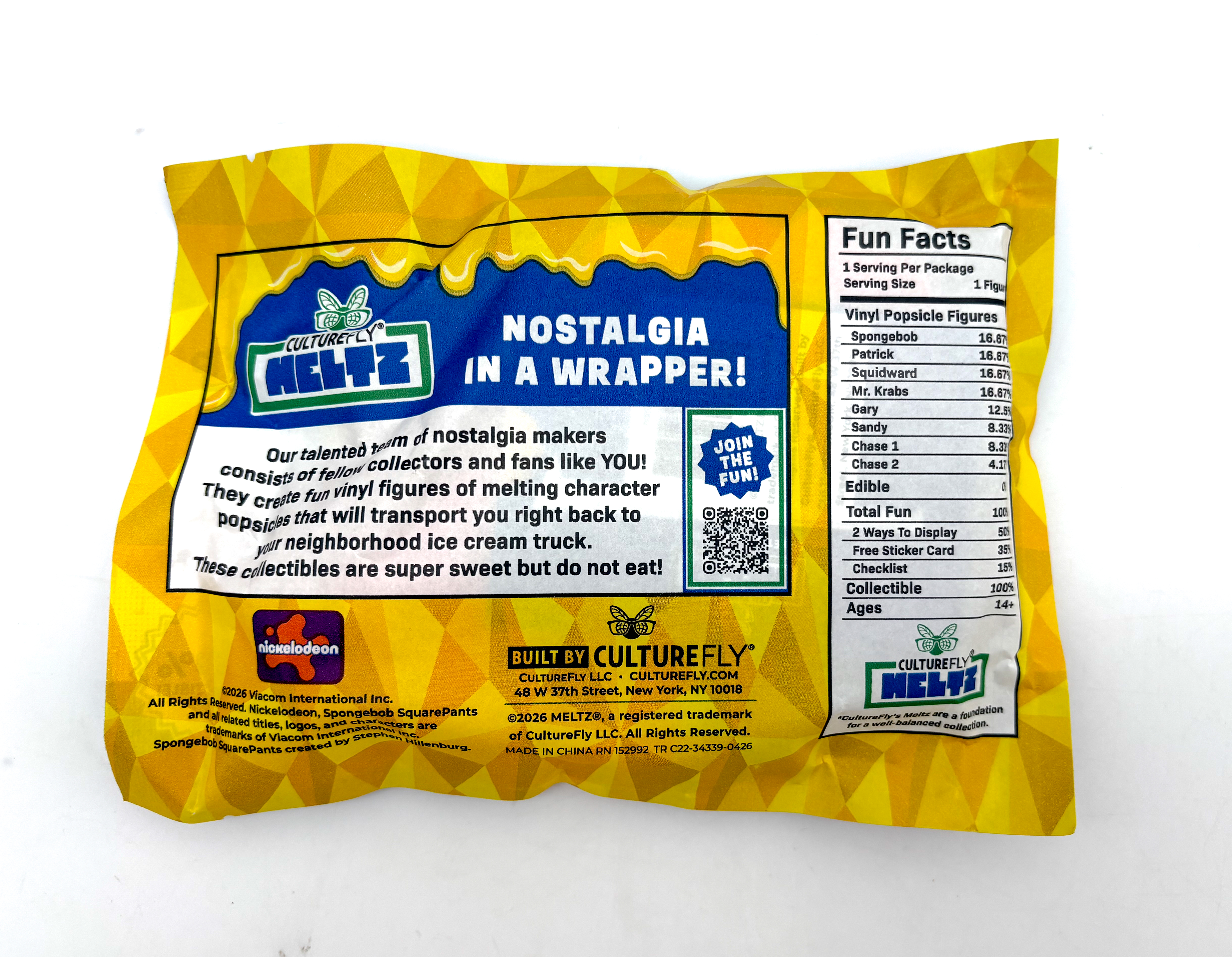
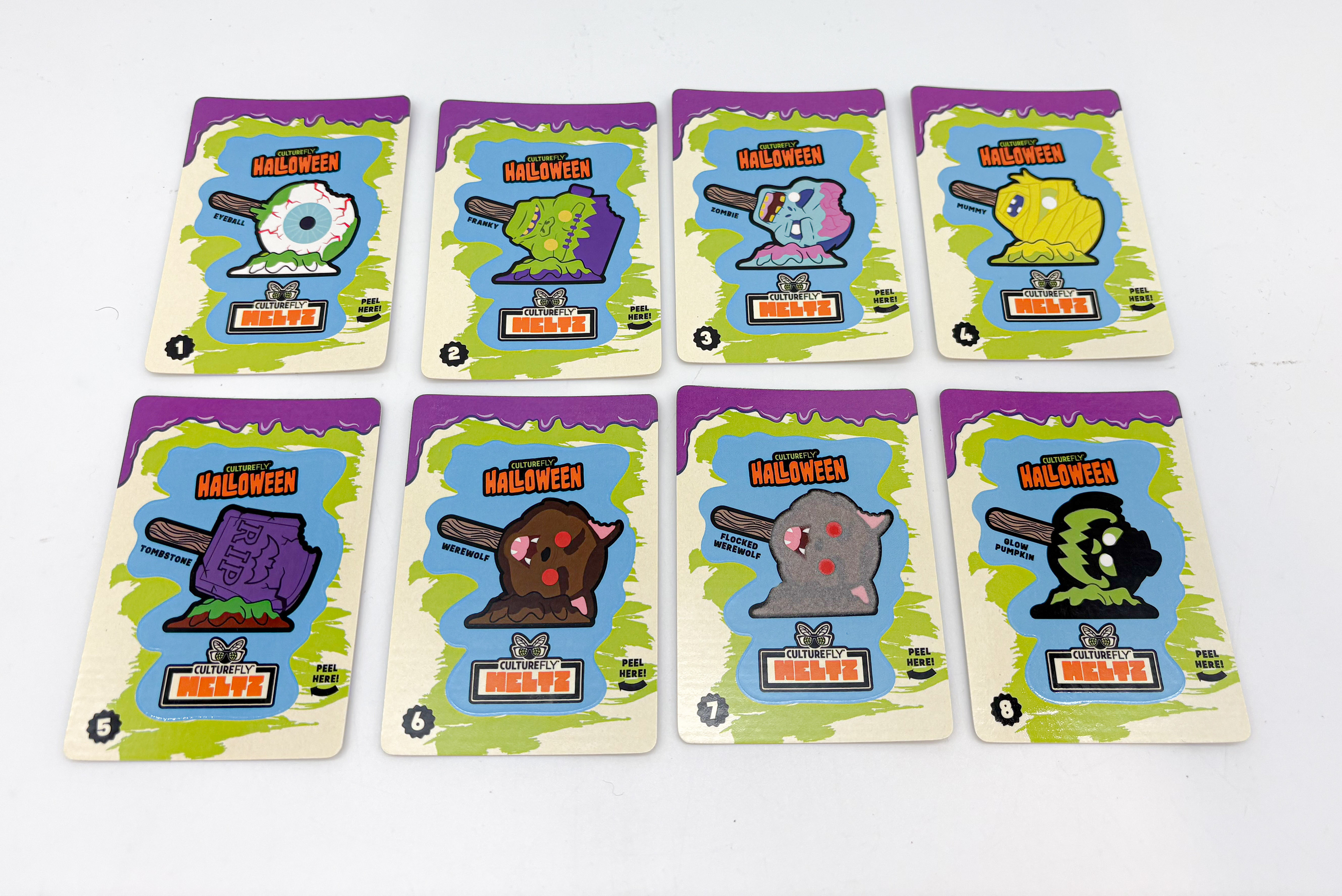
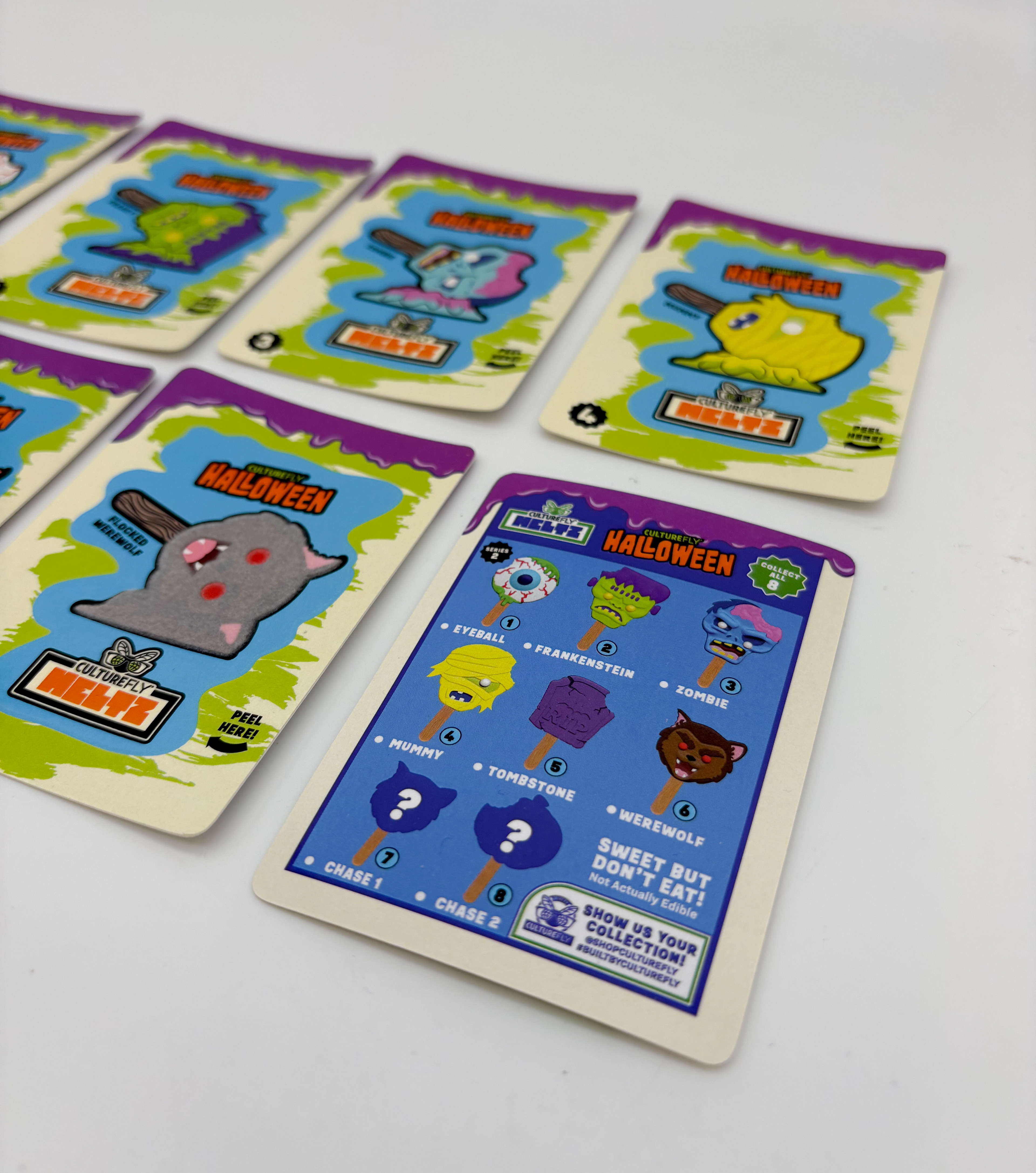
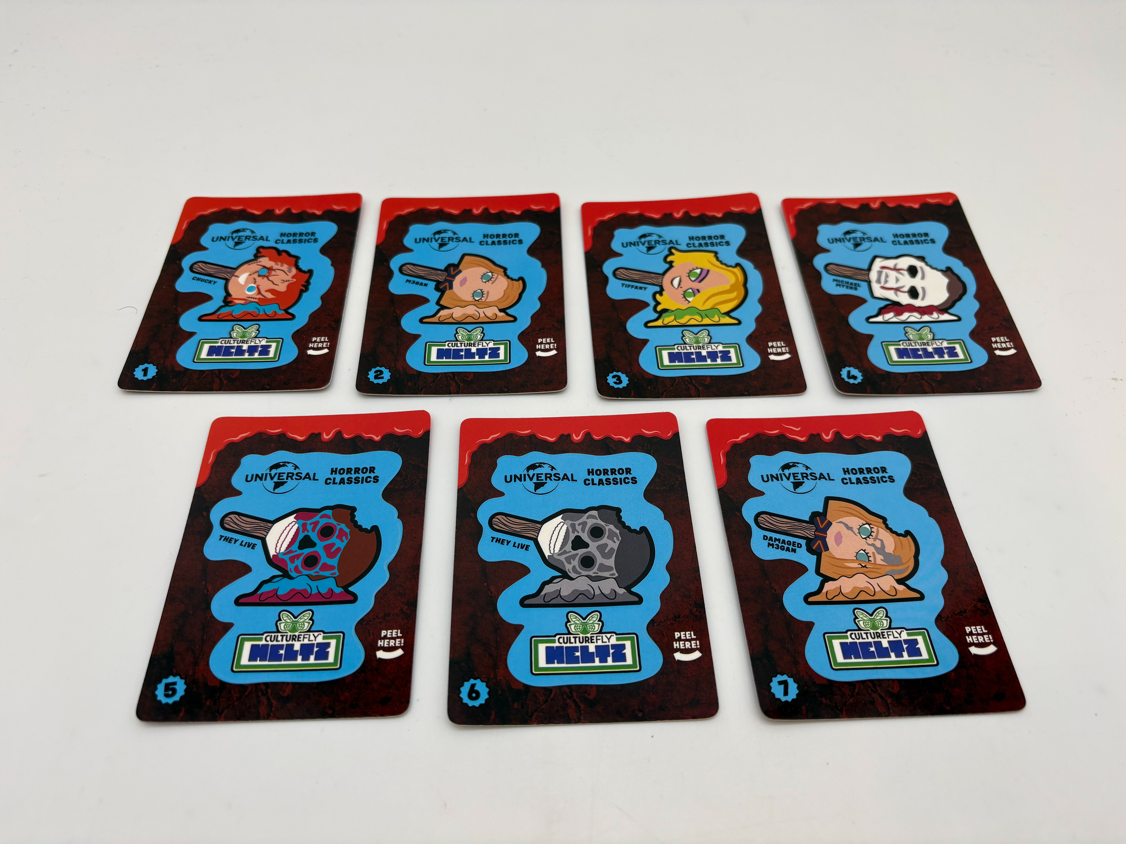
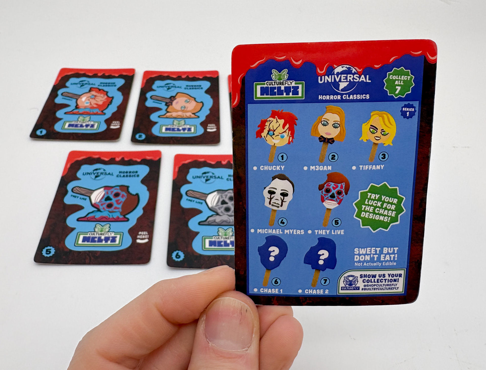
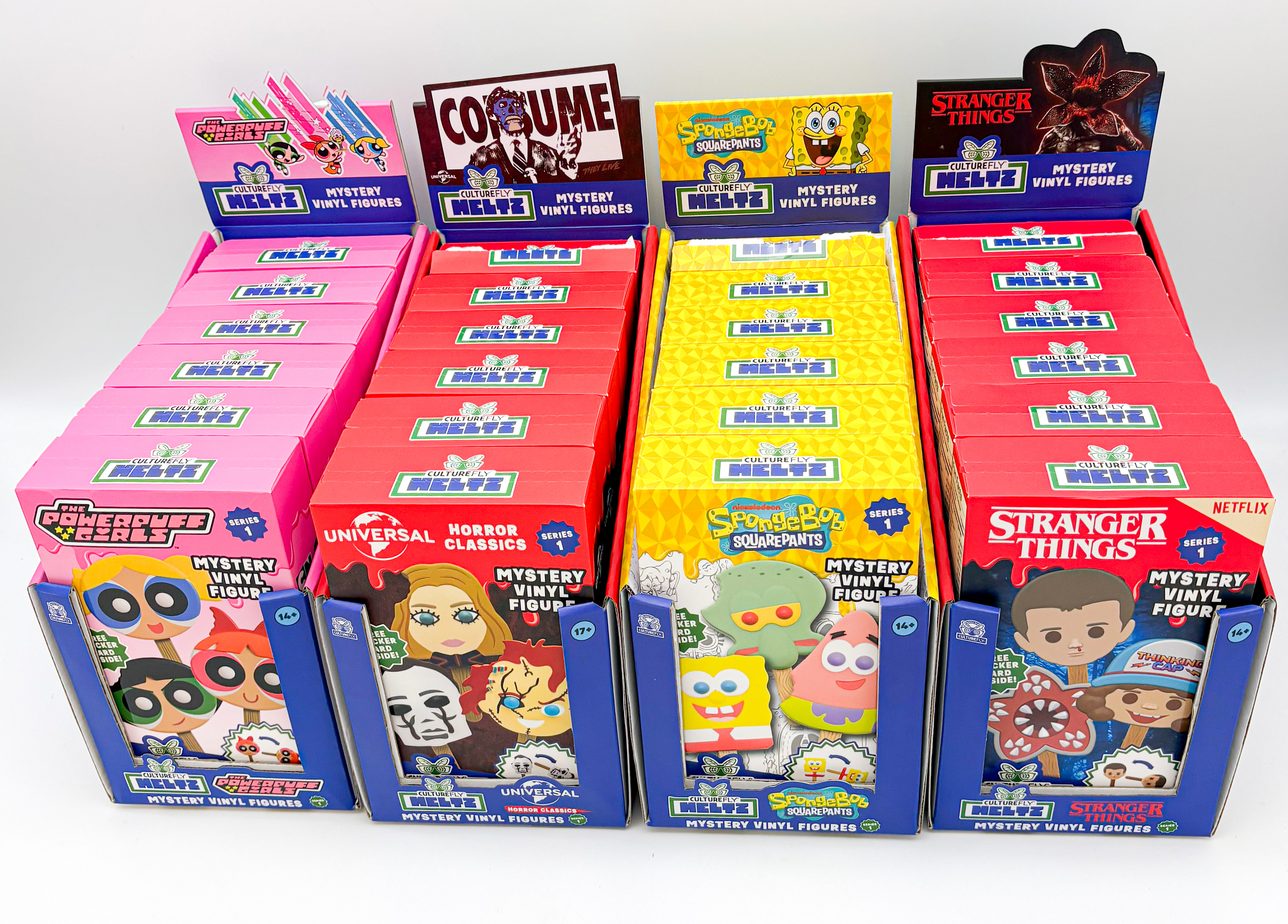
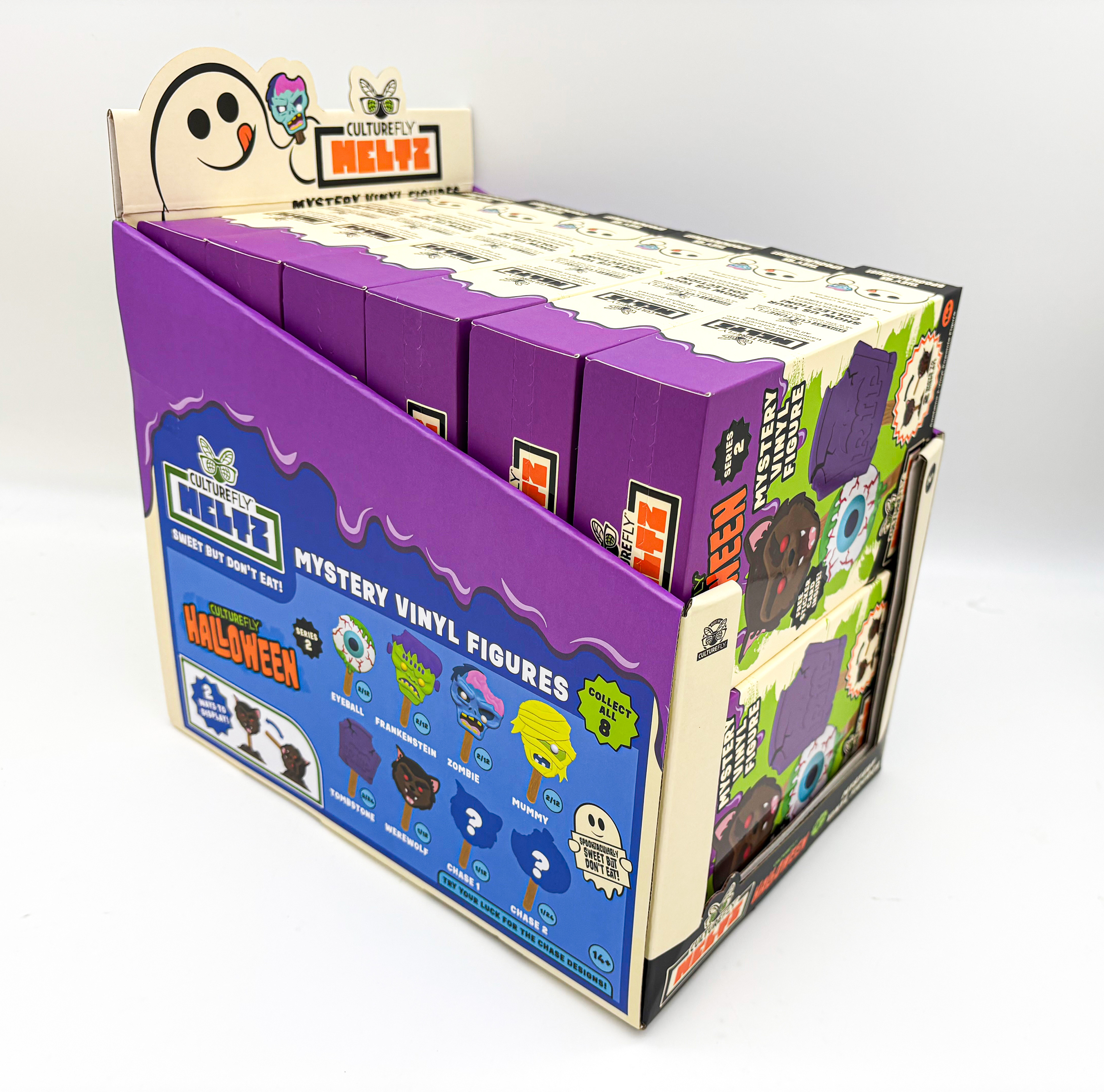
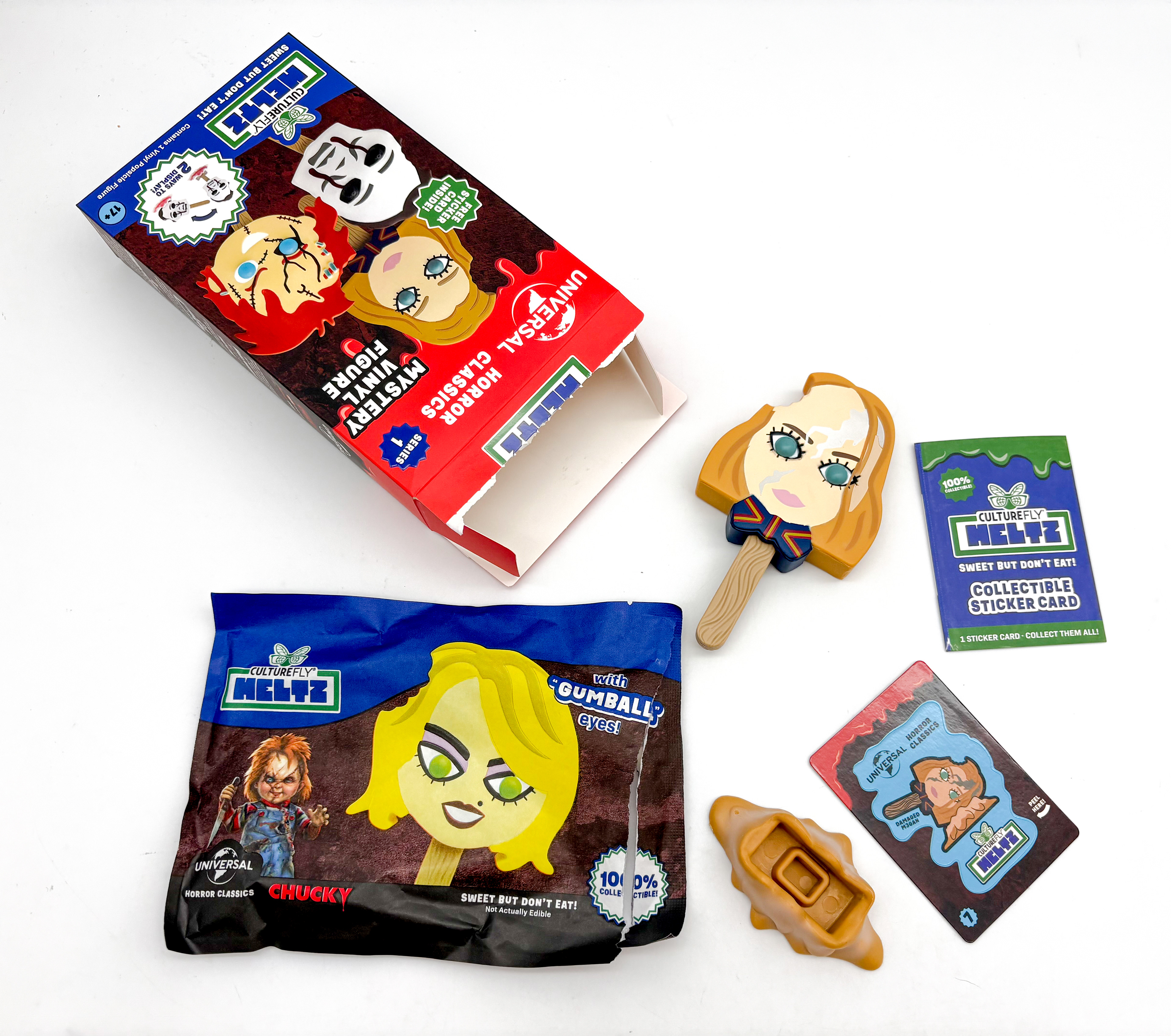
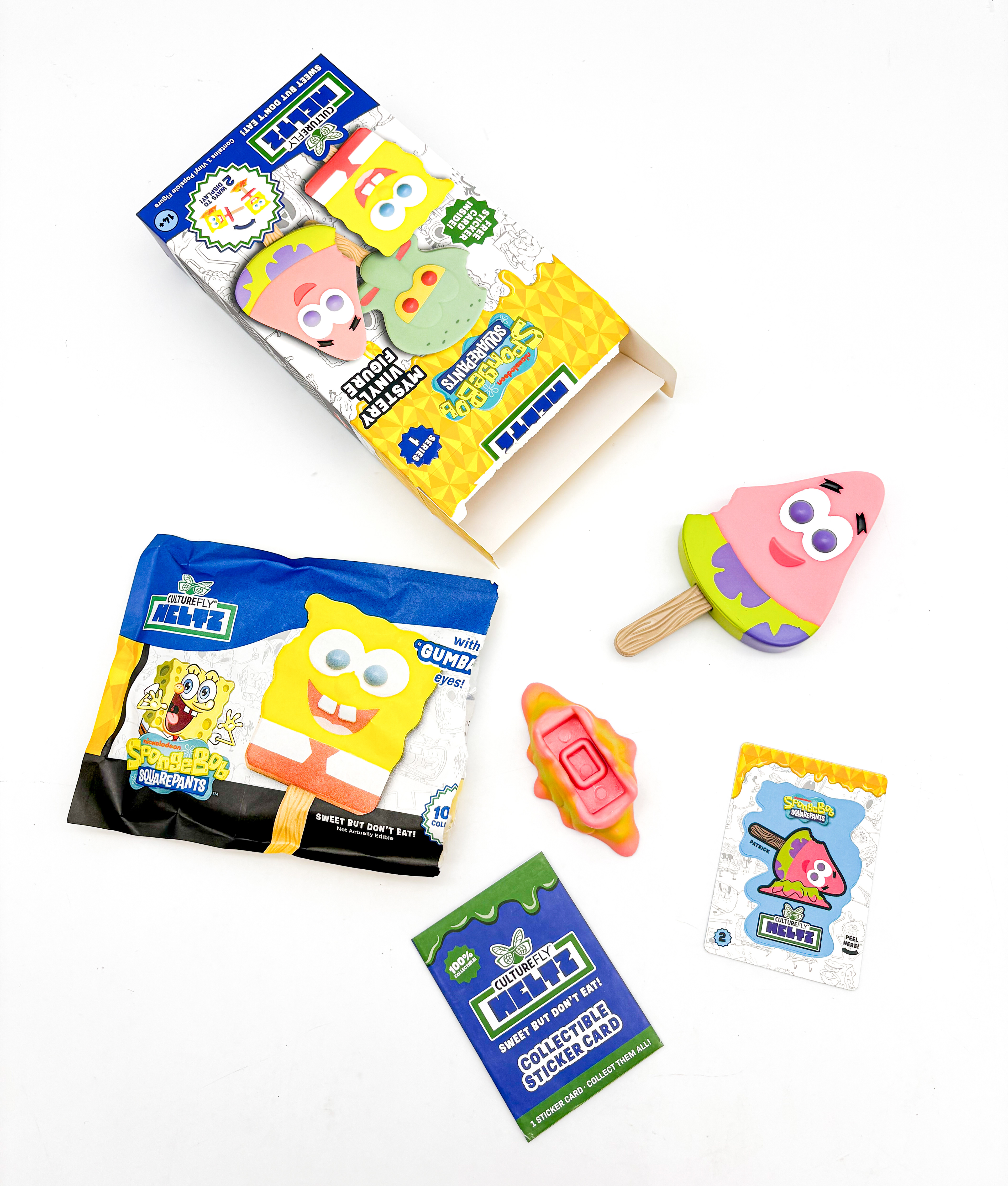
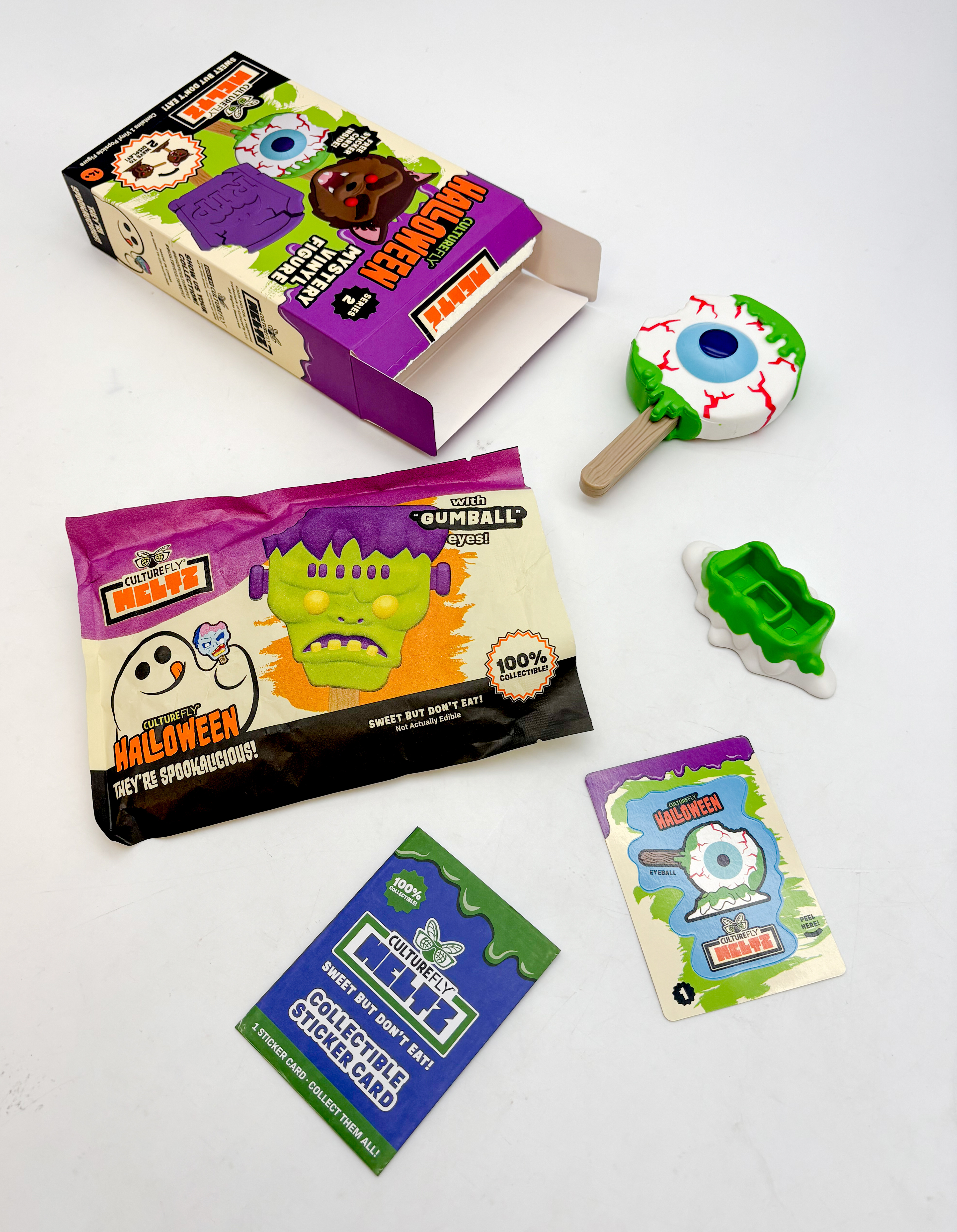
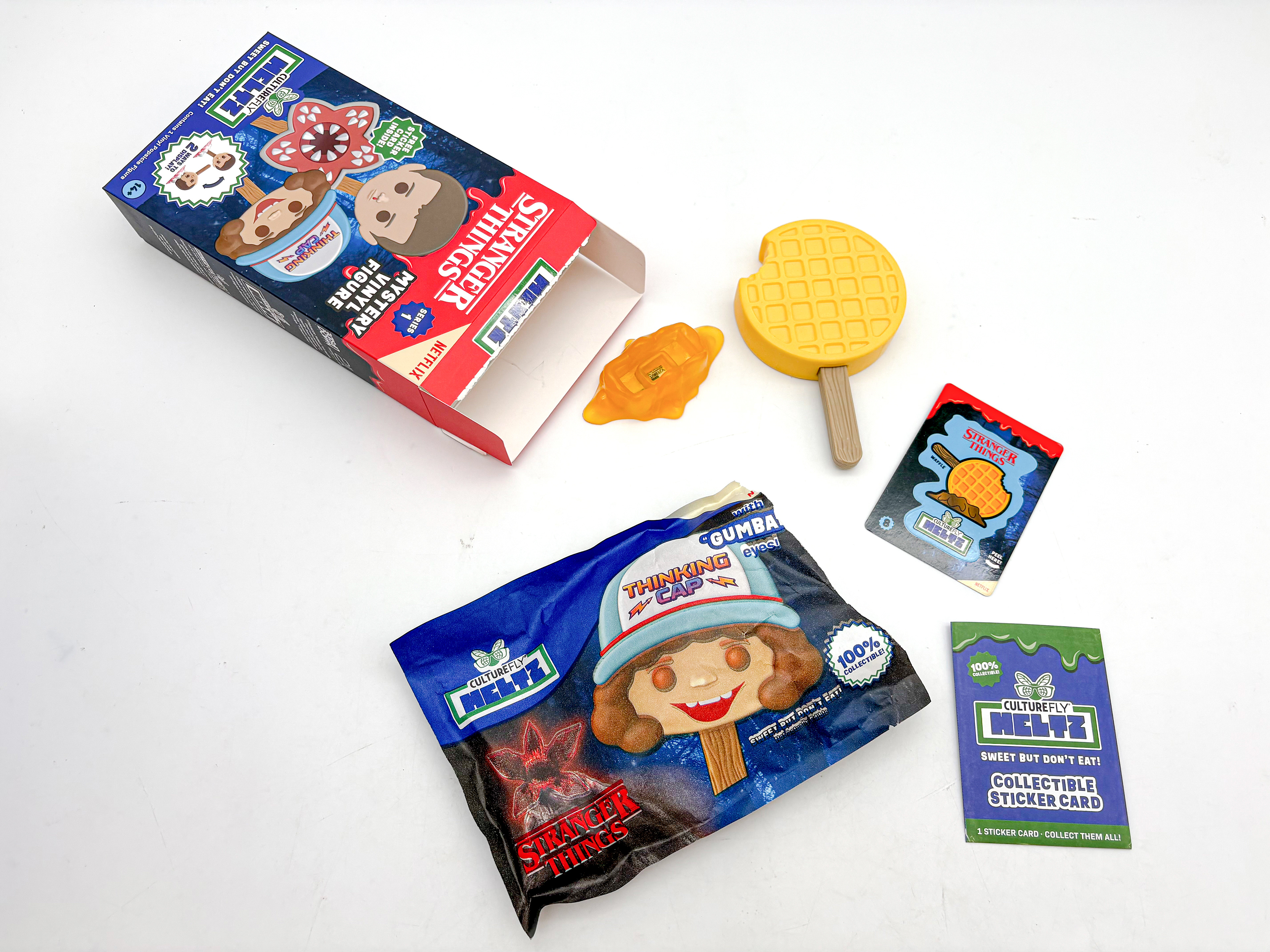
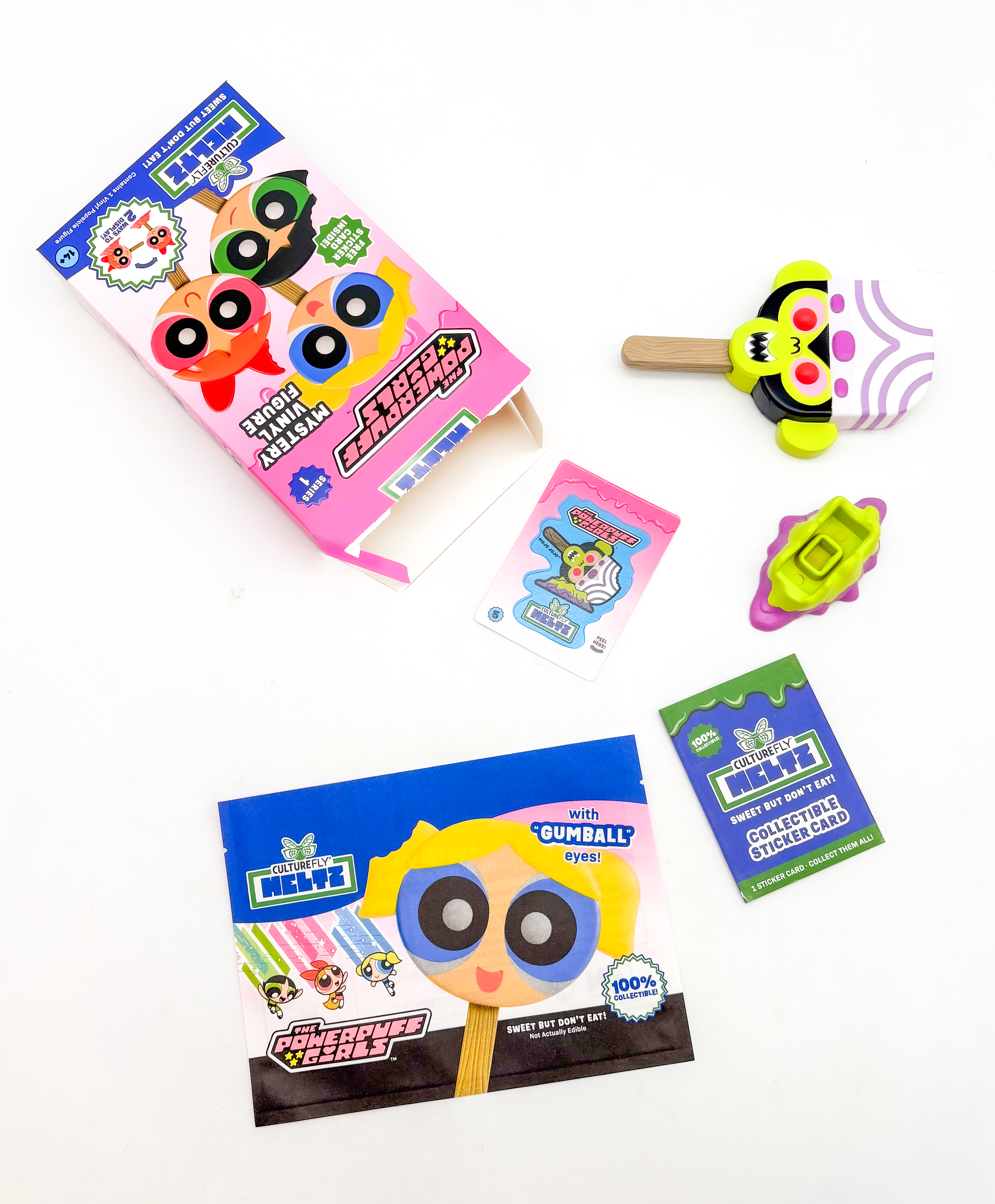
The new packaging was very well received by Target, which then invited us to develop an acrylic display to showcase Meltz in their stores, as well as a sidecap display for an upcoming Meltz extension product. These products launched in Summer 2026 as part of Target’s new collector-focused area and went viral on TikTok, ultimately helping lead to a partnership with Serendipity 3 in New York City.